

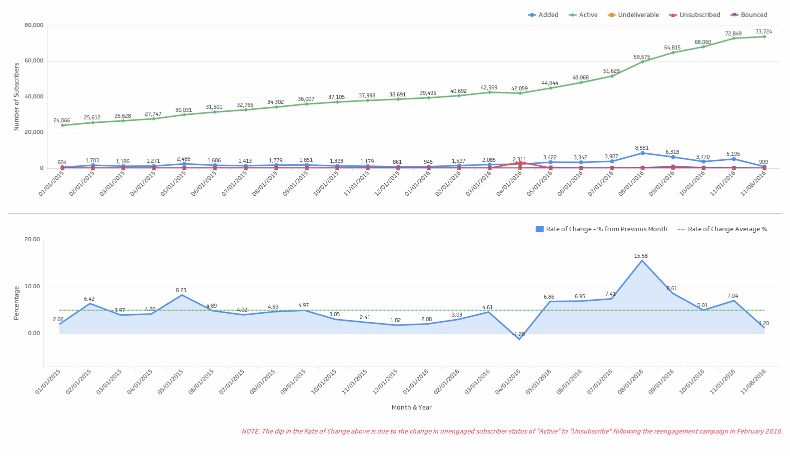
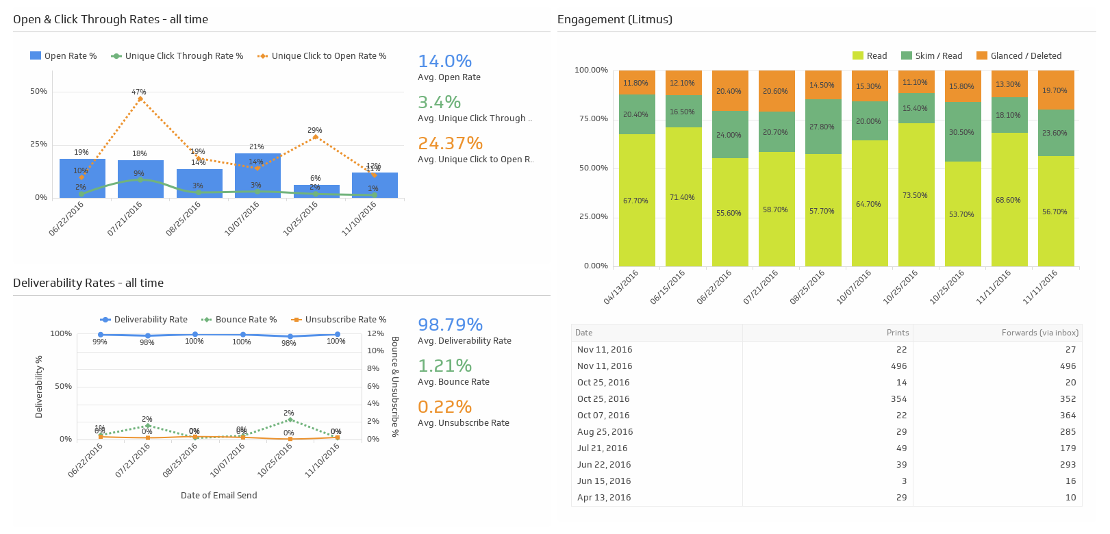
A visual image can tell a greater tale than looking at a variety of spreadsheets or paragraphs of text. In the case of email marketing, using a dashboard is a good way to notice trends of key performance indicators (KPI’s) such as subscriber growth, engagement and conversion. Whether it’s growth or decline, pulling your data into a visual can save time in digging for answers or finding a quick solution.
Klipfolio is our data visualization vendor of choice. They have made it easy for our clients to evaluate their email marketing program using Excel-like formulas. We’ve created many custom visualization Klips (as shown to the right and below) as well as used one of their pre-built visualization Klips for many of the integrated data sources they have available.
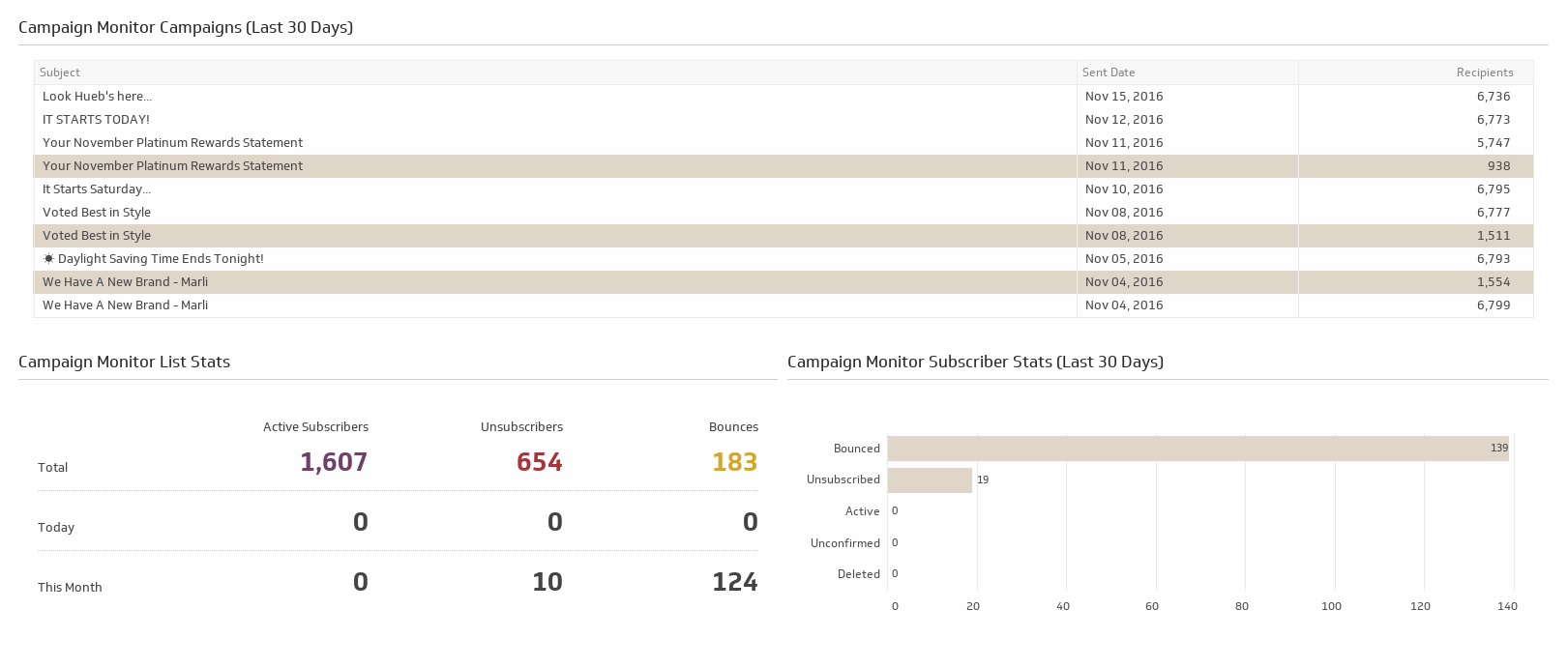
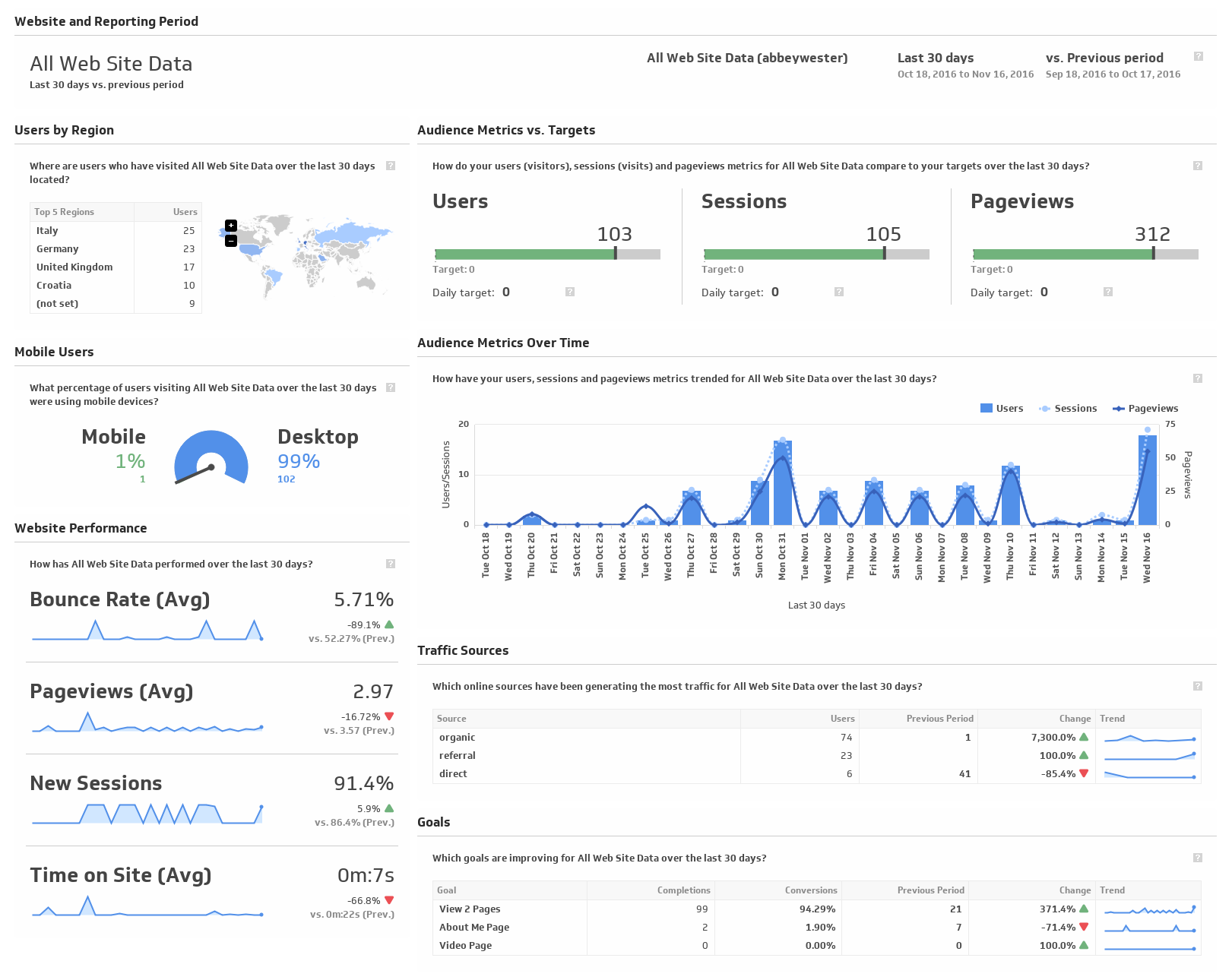
Pulling the data into a dashboard can be automated or done manually. Klipfolio, like many dashboard software providers, has a multitude of integration capabilities like the two shown below for Campaign Monitor and Google Analytics. Using SFTP, we’re able to import an automated report from the Salesforce Marketing Cloud. However there are times when a manual import of a data source must take place to complete the story. Refreshing the dashboard depends on the integration of the data source. Each dashboard is interactive, allowing you to hover over for greater detail, drill down or access the raw data source for more insight. Sharing with your fellow team members is easy with a link or PDF or image downloads.
The downfall of a dashboard is that you risk becoming complacent. If you get used to the history, then you may not explore the full story. A dashboard is more than a reporting tool to monitor performance. By adding valuable KPI’s from a single data source or multiple sources, you can build the visualization Klips needed to build a stronger and better email marketing program.
To answer questions or explore dashboard capabilities for your email marketing program, please reach out to [email protected].