With all the emails that end up in your inbox, there are always a few that stand out. Here at RootedELM, we are email geeks–we admit it. Whether it’s outstanding content, design or development, when we see it, we want to share it. Watch for our insight here, direct from our own inboxes, and use it to inspire your next campaign.
JASON’S PICKS
REI CO-OP
SUBJECT
Member Coupons are Here!
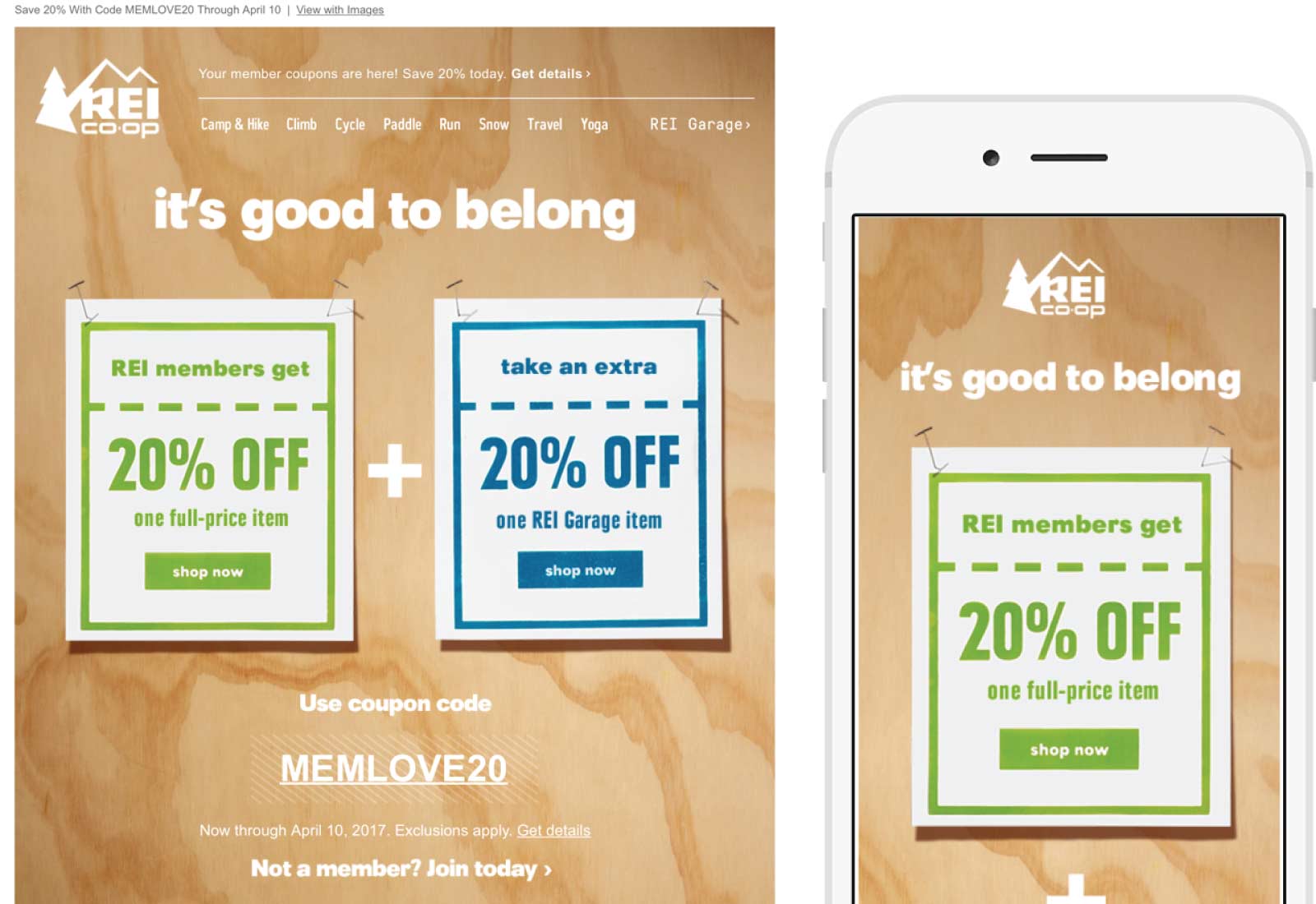
REI knows their market, their members, and their non-member customers very well. This is another perfect example of them tailoring their campaigns to their members and the devices they’re reading these campaigns on. While the email is very much on point when it comes to the REI brand, it also ensures that regardless of where you’re viewing the email you get a great experience and can easily read the email.
Too many retailers tend to focus on a desktop only approach to their emails, which can make it difficult to convey your design properly and extremely difficult to read. With mobile opens of email approaching 60% of the market, one would think that retailers would move this direction en masse; unfortunately, they aren’t. This email is a perfect example of having the best of both worlds; using the same assets from the traditional desktop version of the email to create a perfect experience for mobile users.
VIEW THE EMAIL SCOPE
Harry’s
SUBJECT
The easiest way to try Harry’s
The razor and men’s grooming market is a crowded space and Harry’s is using email to stand out from the pack. Upon signing up for their email campaigns you’re greeted with a welcome journey that is on brand, short and to the point and explains what Harry’s is and how it works. While most have some sort of on-boarding for new subscribers, a lot of marketers seem to struggle with what those welcome emails should be. Harry’s has hit it spot on; this campaign is clean, simple and gets the point across.
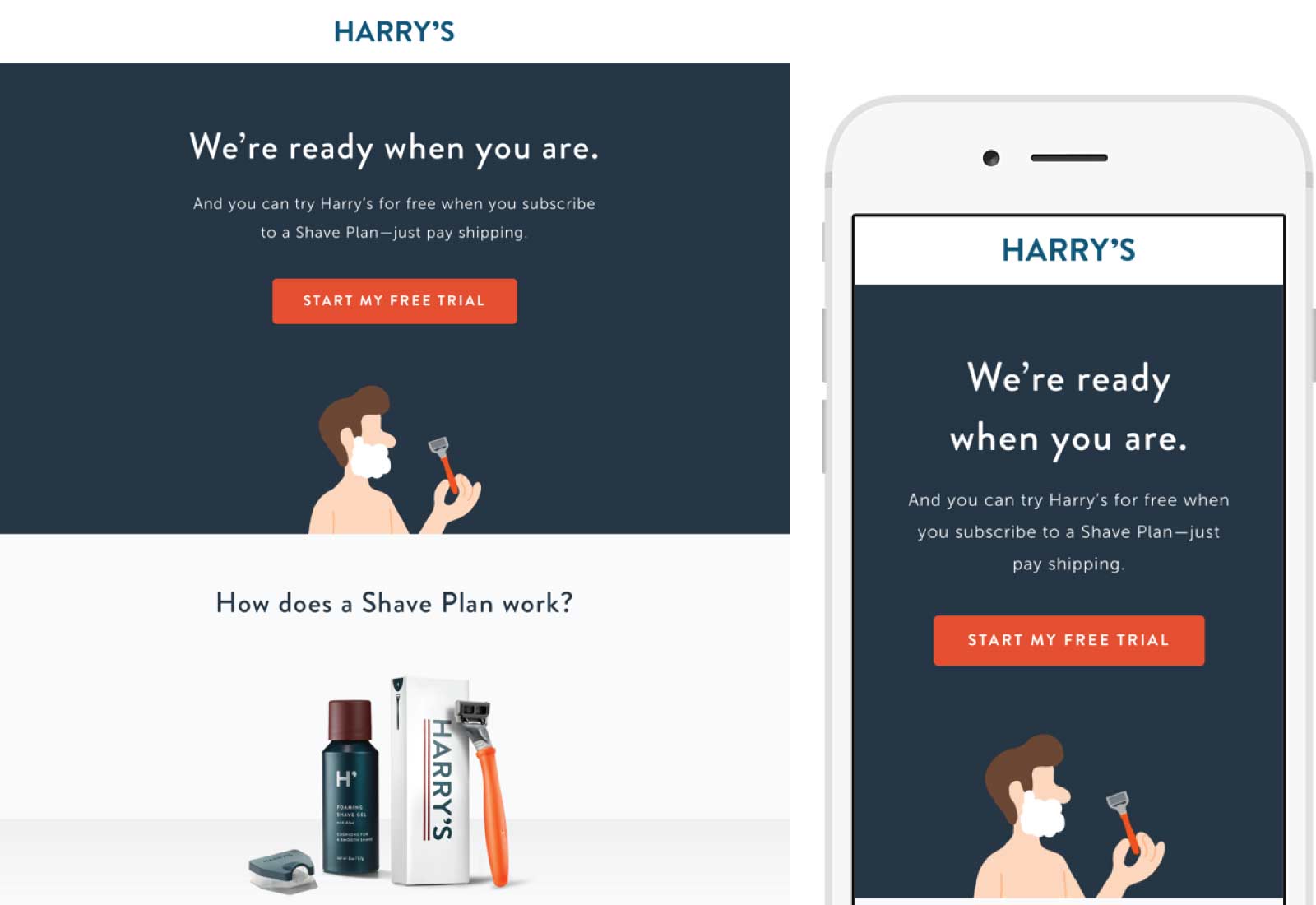
VIEW THE EMAIL SCOPE
Litmus
SUBJECT
Litmus Live 2017 tickets on sale now!
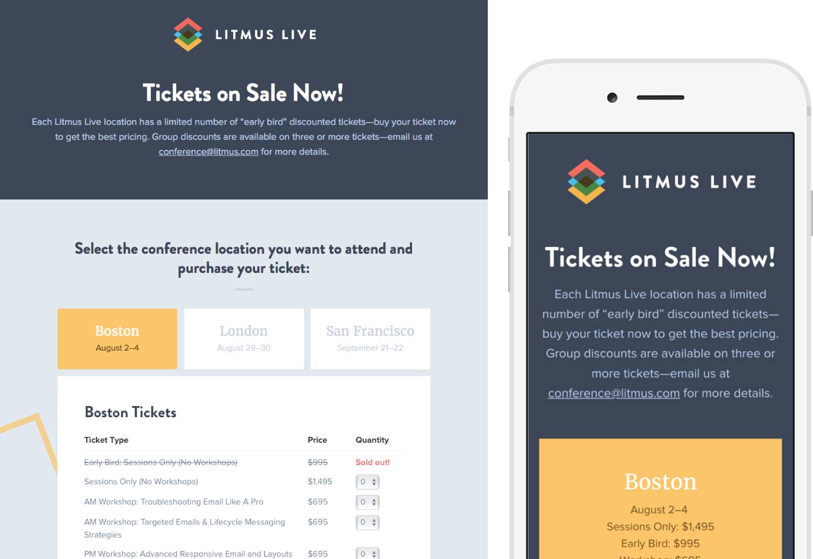
Tickets for Litmus Live 2017 went on sale Monday and Litmus sent an email with all the bells and whistles to let everyone know. Expanding on several of the methods they’ve used in previous emails, they sent an email that for the large majority of their audience was an interactive ordering system. Select which location you want to attend, then select how many tickets you need from the live updating price list (notice that the early birds were gone by the time I took this screenshot). Once you click the checkout button at the bottom you’ll be taken to an Eventbrite page that’s ready for your billing information; one more click and you’ve purchased your tickets.
As always Litmus is a great example of what email can be when you use progressive enhancements to make a much better experience for your largest audience. In the case of Litmus, most of the recipients of this email are opening it in Apple Mail or another Mac OS email client. If you opened this email on a Mac OS email client, you got the awesome live ordering view. If you opened it on mobile or somewhere else you still saw an informative and on-brand email that let you order the tickets.
VIEW THE EMAIL SCOPE

CHRISTINA’S PICK’S
Aveda
SUBJECT
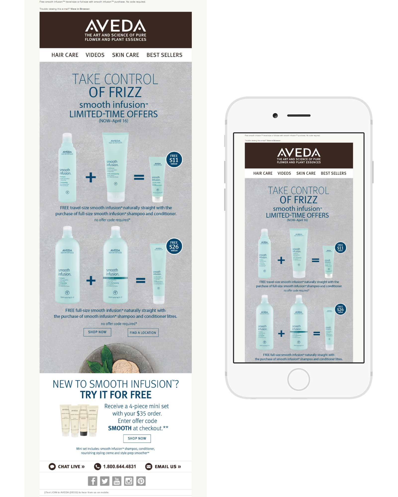
Smooth Solutions, Just for You
As someone with enough hair on my head for 3 people, I can’t live without my Aveda products to keep the frizz under control. This subject line is clear and to the point; I opened right away to access the “Smooth Solutions.” Inside, it was as if Aveda had read my mind with content that says, “Take control of Frizz.” I’m also a big fan of the way they design the images so I can clearly see what the offer entails and choose the best option for my needs. I’m loving the color scheme as well: very soothing–much like their products are for my hair!
Target
SUBJECT
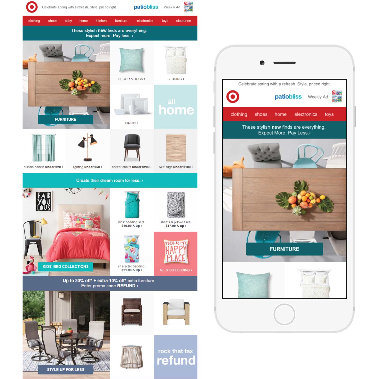
New, now, wow home items
This email was timed perfectly & delivered to my inbox on the first day of Spring with a preheader that reads, “Celebrate Spring with a refresh. Style, priced right.” I’m not normally big on home decorating, but something about the start of Spring has me in the mood to clear out the clutter, open all the windows and start anew. The design of the ad, with square photo boxes, each featuring a singular item refreshing the home, makes it easy to skim and then click for more options in that category.

LISA’S PICKS
Shutterfly
SUBJECT
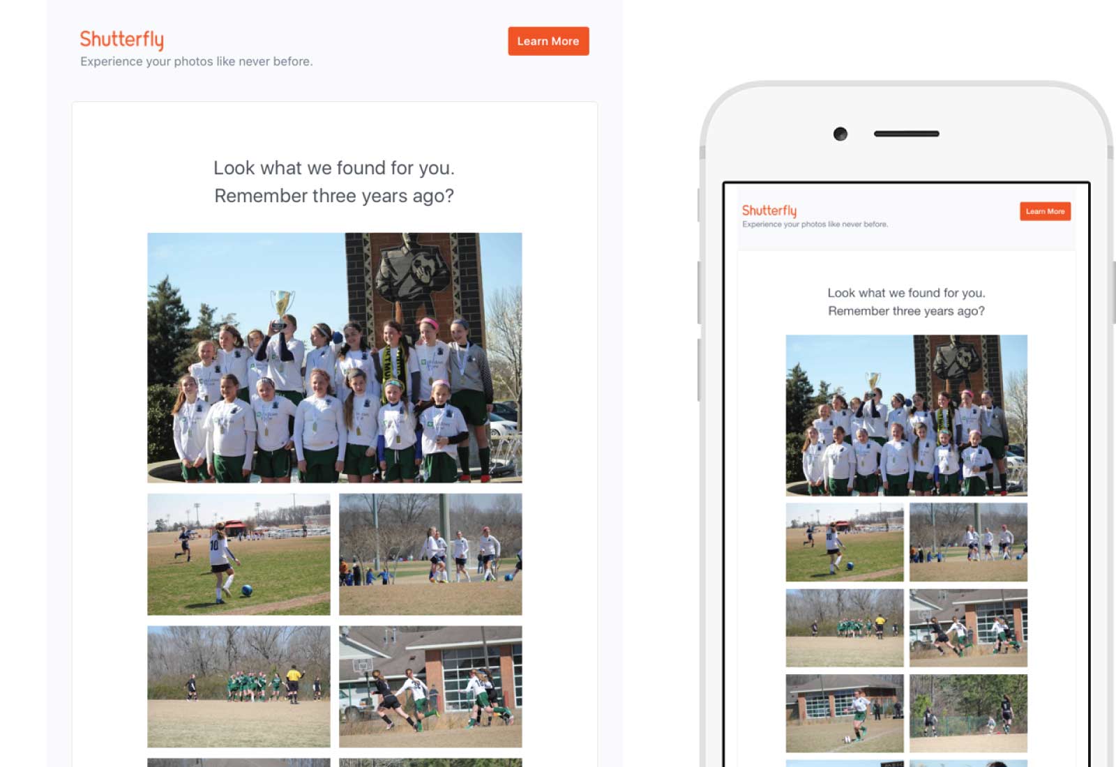
Your memories from this week three years ago…
Shutterfly took an approach similar to what Facebook does on a regular basis with previous posts. They presented the past to evoke emotion by showing photos that had not been developed yet from three years ago. With hardly any text, this simple email would make the perfect “missed you” or reengagement campaign.
J. Crew
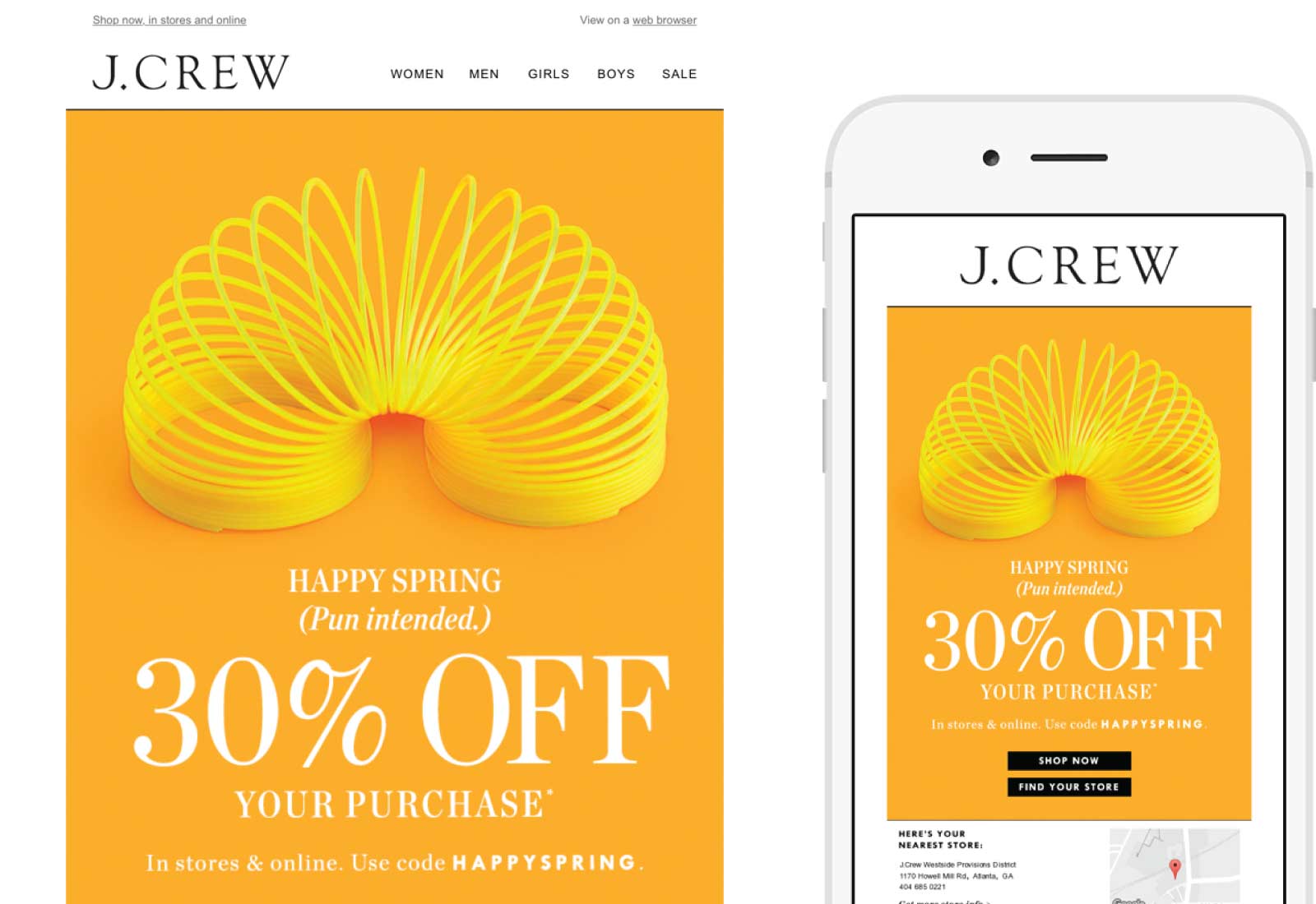
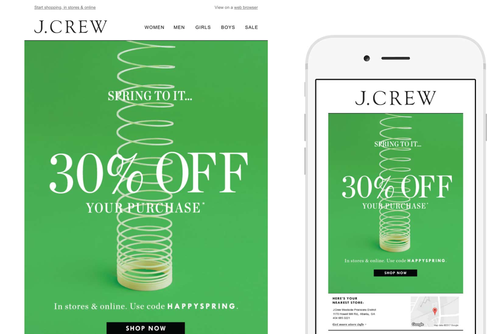
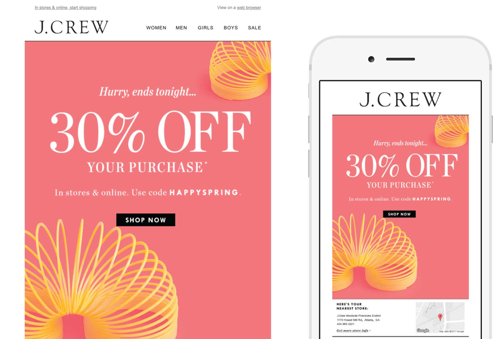
This ingenious campaign series from J.Crew stood out because of its wittiness, timing and vibrant colors used for the Spring theme. J.Crew, while always creative with their campaigns, rotates on a regular basis between product emails and off-the-wall concepts like the three shown below with the springs. With very little text, it’s clear the goal of this email series is the sale, much like the Gap email Jason talked about in our last “Emails We Love” post.
SUBJECT
It’s spring! Celebrate with 30% off your purchase.
SUBJECT
Spring to it with 30% off your purchase
SUBJECT
Act fast! 30% off your purchase ends tonight.
Wistia
SUBJECT
Friends don’t let friends miss discounts
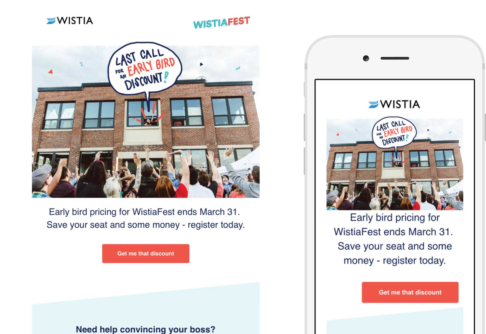
This simple B2B email to me screams perfection — including the subject line! This is another example of using minimal text for clean email design, but have a significant impact on the content. Unlike the J.Crew campaigns, Wistia used formatted text to support the large header image to make it possible to read the content with images off. The blue geometric shape below the crafty friction-free call-to-action looks like a background image, but it is formatted text as well on a blue background. The images surrounding this content area gives it that geometric shape. The same theme is carried over onto the branded landing page to provide more information about the Wistia event so you know are in the right place.
