With all the emails that end up in your inbox, there are always a few that stand out. Here at RootedELM, we are email geeks–we admit it. Whether it’s outstanding content, design or development, when we see it, we want to share it. Watch for our insight here, direct from our own inboxes, and use it to inspire your next campaign.

JASON’S PICKS
Litmus
SUBJECT
Play to win a ticket to Litmus Live
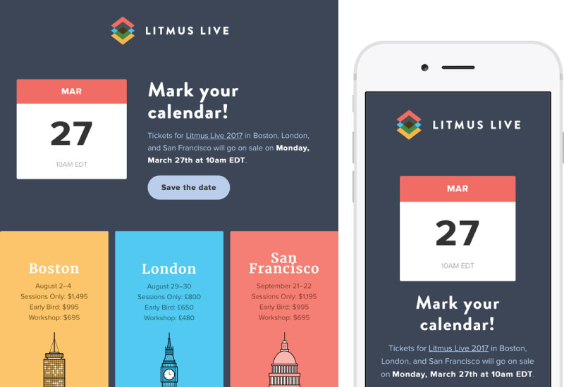
Litmus has been hosting THE conference for email designers for the past several years. Their Save the Date email, while conveying the necessary information, has become a showcase of what email can be; each years more complex than the last. The #emailgeeks community treats it like Christmas Eve as we await to see what bleeding edge designs they incorporate each year.
Litmus did not disappoint, once again proving conference emails don’t have to be boring. As they did last year they incorporated a game to find golden tickets into the email which would grant the first finders of the ticket a free ride to Litmus Live. On tap this year we have dynamic images and text achieved via style sheets dynamically generated server side, a Litmus quiz, a live pageable twitter feed, and an live update on which tickets had been found and who won them.
The bar for next years LitmusLive Save the Date email is stratospherically high.
GAP
SUBJECT
📆 We owe you code HAPPY (plus, a bonus 10% off!)
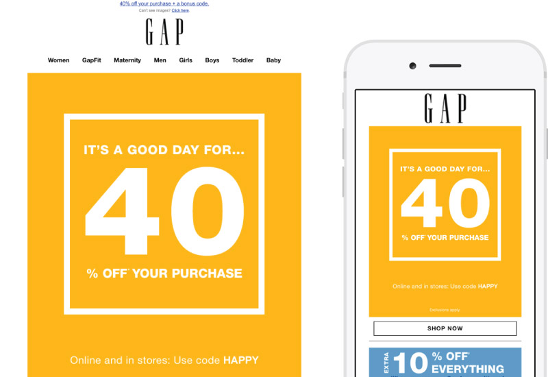
GAP’s emails have gotten progressively better over the years. While most are still close to 100% images – when much of them could be pure text – they have at least made efforts to make sure their images are focused towards how they’ll be viewed on mobile and provide progressive enhancements. This email however stands out for the brevity of it’s main content.
Far too often B to C retailers tend to treat their emails as extensions of their print/in-store campaigns. This results in too much content and too many images in their emails. Sale emails don’t have to showcase a bunch of product images or flowery pun filled language to grab consumers. GAP has proved that with this 40% off email; the message is simple and straight forward. While I don’t necessarily like separating numerals from their percent sign, this is still a great design and a wonderful example of what a sale email can be.

CHRISTINA’S PICK
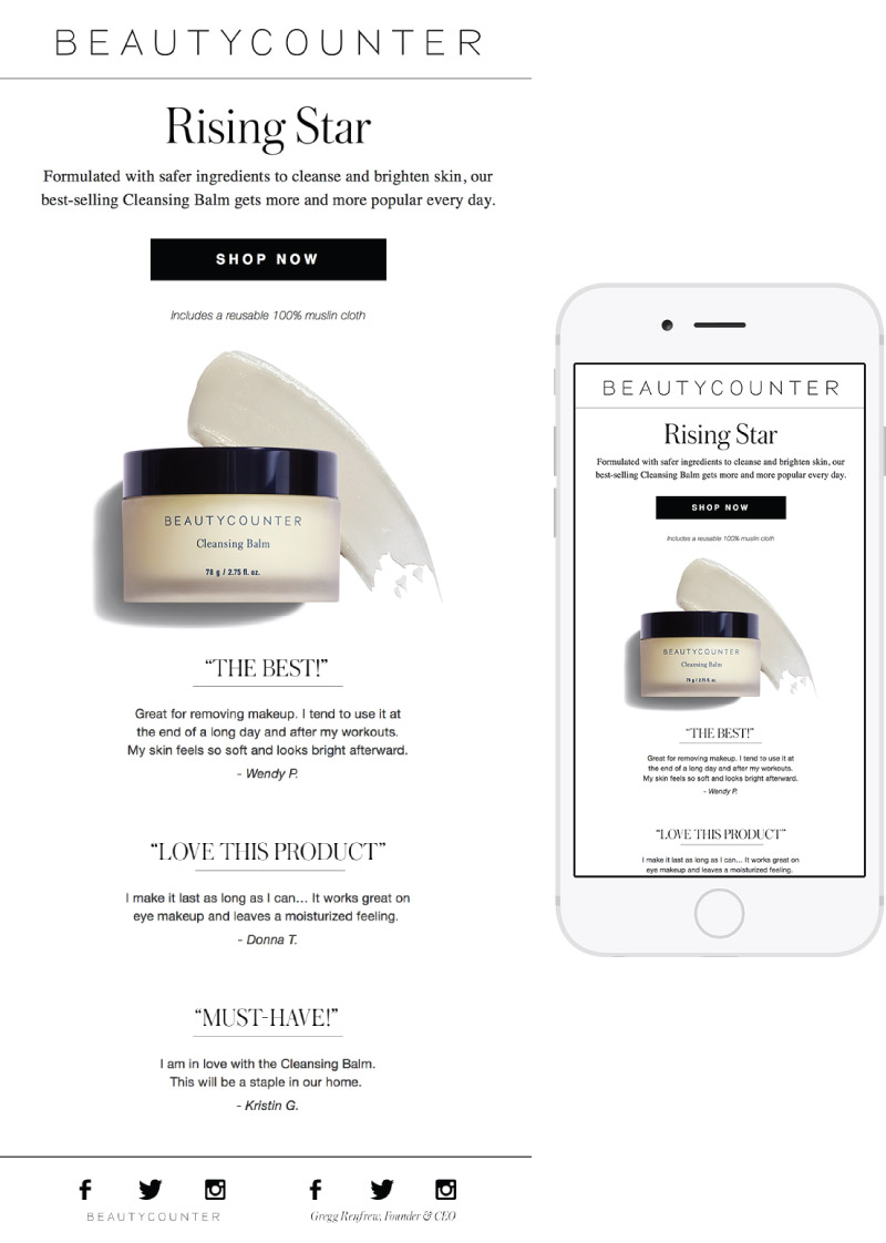
BEAUTYCOUNTER
SUBJECT
It’s a customer fave
I liked the subject line. Seeing, “it’s a customer fave” made me want to find out what everyone else is using from Beautycounter that they love so much. Maybe I would love it, too. Inside, the email continued with the theme with a “Rising Star” headline and then, to back up their claim of “customer fave” they included actual customer testimonial quotes. Overall, this email hit home with the content and I also liked the clean and polished look.

LISA’S PICKS
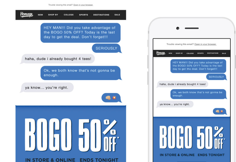
Homage
SUBJECT
Hey yooo! BOGO 50% OFF in store and online
I love this witty and creative email by Homage. The copy and concept of sharing the offer with a friend by text is so realistic because who talks on the phone these days? Everything about this email stood out to me including the Refer A Friend section and the on-brand call-to-action (CTA) button at the bottom. A suggestion for Homage would be to convert the text used through the email as actual text, and not text placed within an image. This will help with the reader’s experience and conversion.
petco foundation
SUBJECT
Let love change your world
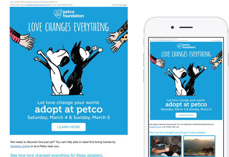
Call me a pet-loving sensitive schmuck but I LOVE the content of this email! It started with the subject line: “Let love change your world.” My favorite part of this email is the use of actual photos. I was instantly drawn and didn’t need to read the text below, or the CTA, to want to read more. The the main, cartoon image is cute and tender evoking emotion.
Just like I mentioned with the Homage review above, Petco Foundation could convert the text toward the bottom of the image and CTA button to actual text instead of an image with text. This will decrease the time to download the image, while making it clear what the email is about. The branding with the cartoon image is carried through to a landing page telling me more about the upcoming adoption event. The Donate Today CTA is perfectly placed in the bottom right where my eye finds itself to click through to another branding landing page — reassuring me I’m where I need to be.