
With all the emails that end up in your inbox, there are always a few that stand out. Here at RootedELM, we are email geeks — we admit it. Whether it’s outstanding content, design or development, when we see it, we want to share it. Watch for our insight here, direct from our own inboxes, and use it to inspire your next campaign.

CHRISTINA’S PICK’S
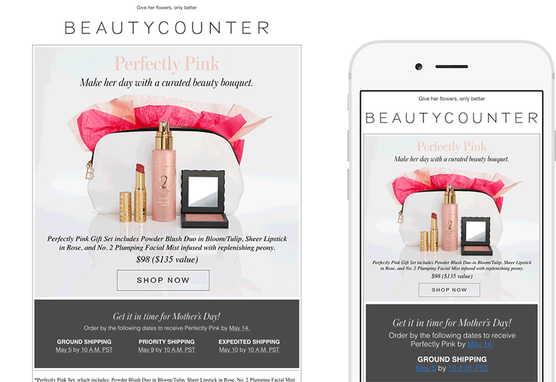
Beautycounter
SUBJECT
A gorgeous gift set just for Mom
I’m almost always drawn into an email based on the copy, which makes sense, given that I’m a content nerd. Of course, with Mother’s Day right around the corner, I’m looking for something special for my own Mom, so I opened this email out of curiosity. But what caught my eye on this email wasn’t just the content, but the animation of the words “Perfectly Pink&rdqou; once I opened. The clever play with words—“Give her flowers, only better,” followed by “Make her day with a curated beauty bouquet,” was the perfect touch for this sweet email that made it way too easy to finish my Mother’s Day shopping.
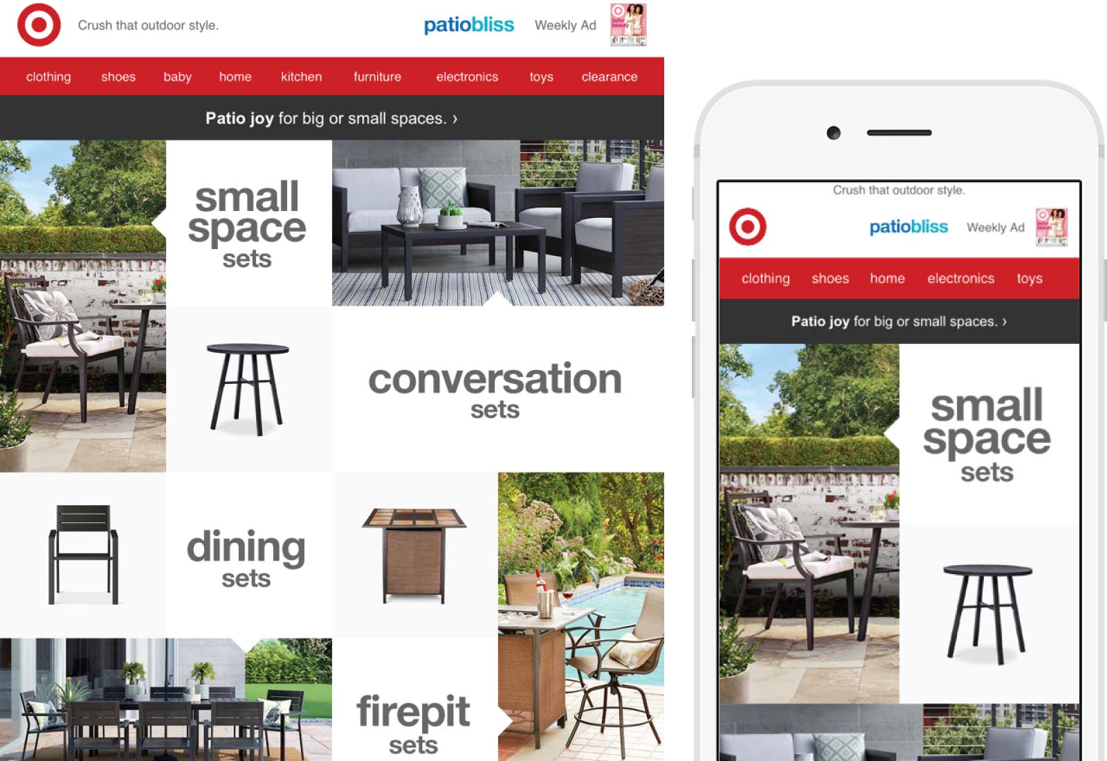
Target
SUBJECT
Patio furniture perfection
I really liked the simplicity of this Target email. I’m in the market for patio furniture, so the subject line immediately caught my eye and the preheader, “Crush that outdoor style,” gave me confidence. The email went on to make it easy to shop, depending on my patio needs. The photos of each set of patio furniture flow into the next set, drawing me further down and through the email. Overall, I liked the design layout and clear, concise copy on this clean, easy to read campaign.

LISA’S PICK
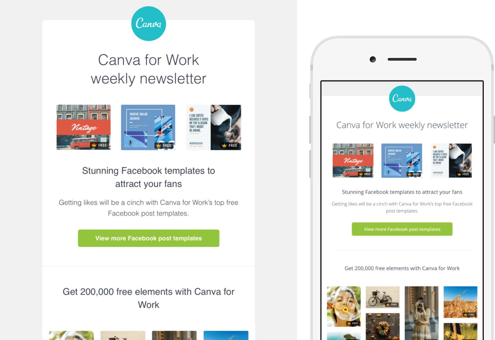
Canva
SUBJECT
Design awesome Facebook post with our top weekly picks [Canva for Work]
How did Sherwin Williams know I needed to paint my front door? This very helpful campaign, animated with five colorful visuals, caught my attention immediately. The mention of the sale completely slipped by me as my focus was on the animation and which color combination would be perfect for my entrance.
Canva for Work did a nice job with this email newsletter as it’s visually pleasant and clean. Canva for Work is an online design product for the “non-designer” like Christina and I. We use this tool on a daily basis, so the content they are promoting here is on point and very helpful.
Canva for Work gets bonus points here for using actual text instead of text within images, so even with these beautiful images turned off, I can read the email to as it is intended. They have also used friction-free CTA’s so my anxiety to click-through to learn more is very low.
The visual of the Canva pro-tip: left aligned at the bottom is a nice example of showing how to use the tip within the product and the outcome. Personally, this is one of my favorite B2B email newsletter’s I’ve received so far.

JASON’S PICKS
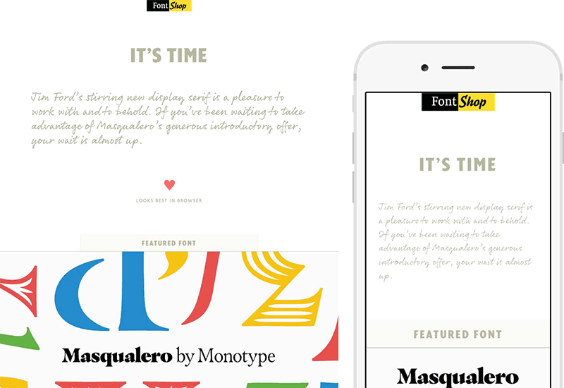
Font Shop
SUBJECT
It’s Time – Masqualero Promo Ends Tomorrow
Aside from their great design, Font Shop – unlike some other foundries – makes a point to use webfonts in their emails. While the featured font in their emails aren’t always represented in actual type, their commentary and all other text has their specific fonts applied to them. They even add the extra step of letting people on desktop/webmail clients that might not render webfonts that they need to look at the email in the browser for the full effect. The only drawback is that with recent changes in the email client landscape they could easily change their code to remove the “looks best in browser” for a large portion of their audience as the overwhelming majority probably are able to see the webfonts in the email.
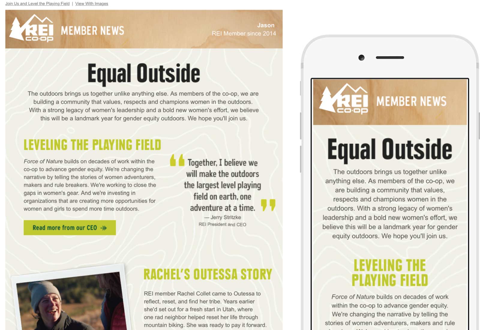
REI Co-op
SUBJECT
Why We Are Putting Women Front and Center
I’ve featured REI before but they truly do have a great email program and that includes their monthly member news emails. This month they’ve focused on their “Equal Outside” initiative to bring gender equity outdoors. The design matches their in store POS and other material produced and really drives home the REI feel while remaining on topic. A great email to match an equally great cause.
The only suggestion I’d give is to ditch the image CTA’s and image Headers and use actual text. While the Outlook folks might not see the branded font, it will greatly reduce the size of the email and make it even easier for those with disabilities to read.
Here you can create the content that will be used within the module.