
JASON’S PICK
Meijer
SUBJECT Garden deals + $20 off a Char-Broil grill
Unlike many other retailers grocery and general store’s rely heavily on their weekly ads, mainly as their prices and selection can change on an almost daily basis. Sending these as weekly emails though tends to fall in two camps — those that try to make their email look like the print ad (all images of course) and those that try to adapt to the medium at hand. Meijer has moved over to the latter group in the past year and it’s a good example of how you can have a weekly ad campaign without a horrible experience. Meijer’s first step to decluttering the weekly ad email experience is they’ve separated their campaigns into a grocery and general merchandise weekly campaigns. This is their general merchandise campaign and — like the grocery one as well — they’ve selected several key items from their ad to feature. The large images and prices make it a clean and simple email and the subscriber always has the ability to click through to the full ad on their website. For their mobile subscribers everything collapses to keep the large images and price points and they even selectively remove items from the footer for a better layout.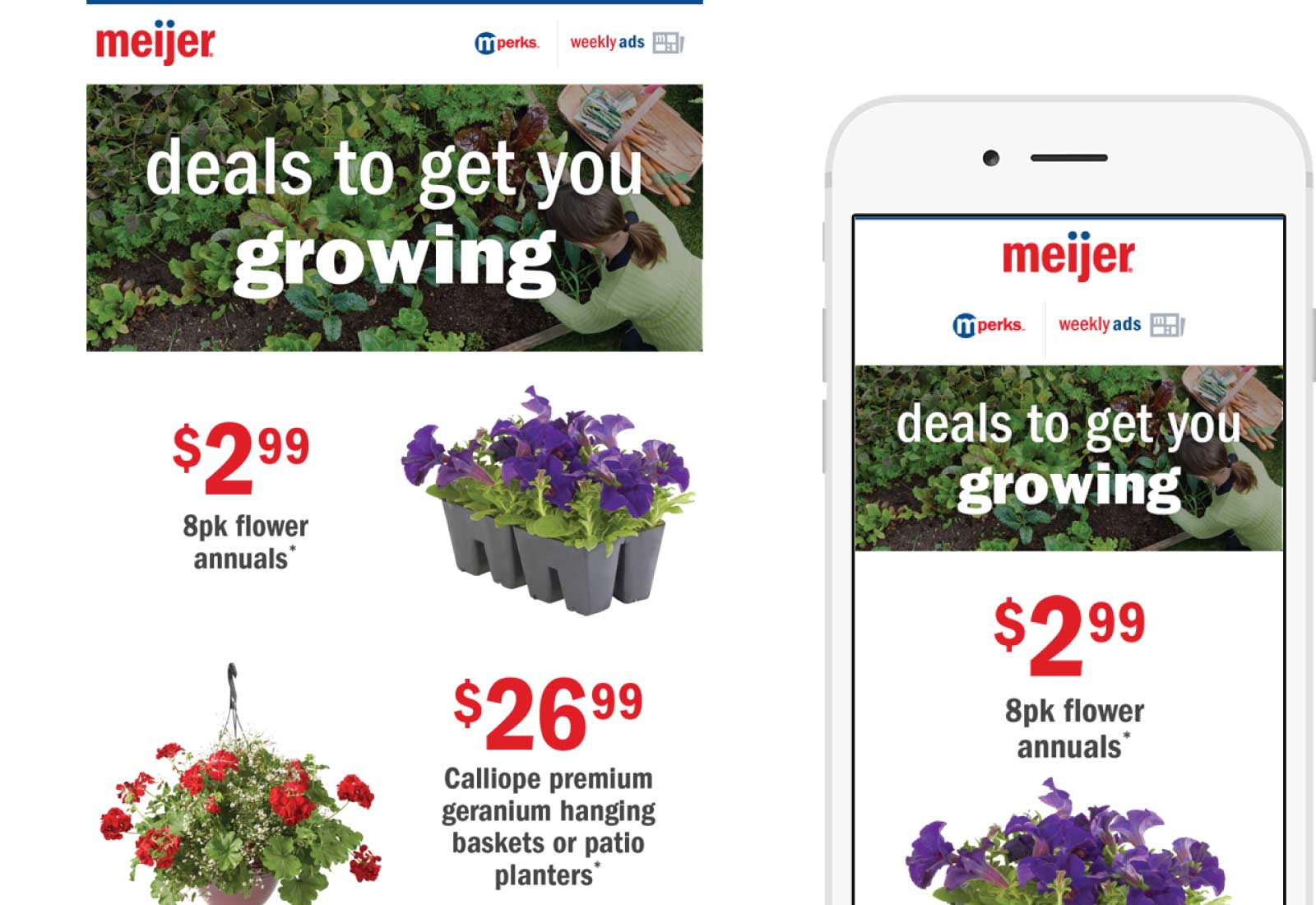

CHRISTINA’S PICK
Thirdlove
SUBJECT Bras 101 – Caring for your 24/7™ T-Shirt Bra
One of the best aspects of this email was the timing. I had recently purchased one of these bras (which by the way, comes with a “try for free” policy to guarantee the perfect fit). Several days after receiving my purchase, this email was delivered to my inbox offering step by step instructions for keeping my purchase as good as new. I like the “4 Easy Steps” complete with breezy sketches, and I’m in love with the copywriting on this one, which reads as if an older sister or friend is casually offering me advice over a cup of coffee.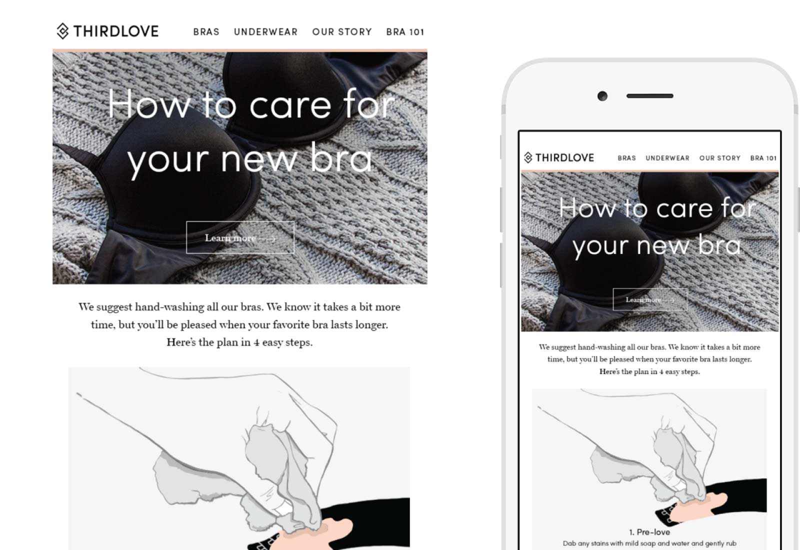

LISA’S PICK
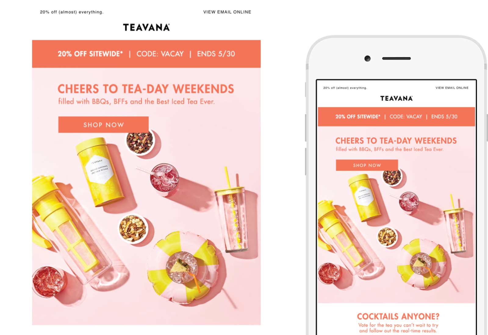
Teavana
SUBJECT Let’s Get This Weekend (Sale) Started
What a fun subject line! It gets even better with the crafty header — “Cheers to Tea-Day Weekends filled with BBQ’s, BFFs and the Best Iced Tea Ever.” So I became super excited when I saw the survey at the bottom. It’s not asking for your favorite; the call-to-action is enticing me to try something new. At first I thought the populated survey results were stagnant images showing results from the time of send, but when I took a closer look after clicking through and refreshing my email screen, I noticed my vote counted and the percentage increased! It was dynamic (literally) thanks to images being generated at load time via MovableInk. This email uses consistent branding—from the email received to the landing page—even showing me several offers that would apply to my interests. I rate this email as an exceptional example of engaging the subscriber to obtain feedback for product interest, as well as collect data for personalization and future offers.