With all the emails that end up in your inbox, there are always a few that stand out. Here at RootedELM, we’re email geeks — we admit it. Whether it’s outstanding content, design or development, when we see it, we want to share it. Watch for our insight here, direct from our own inboxes, and use it to inspire your next campaign.

JASON’S PICKS
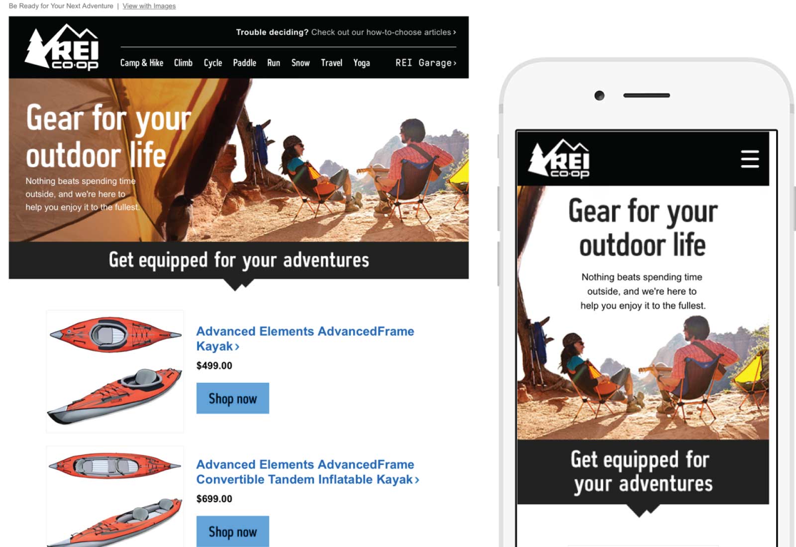
REI Co-op
SUBJECT
Ready to Get Outside?
Abandoned cart and no purchase transactional emails can be extremely engaging and profitable too. Retailers often make the mistake of making these emails seem a little creepy in nature — no one likes a stalker. REI has taken a less “stalkery” approach to their remarketing emails and crafted them so they aren’t too different from their standard marketing fare. All this while of course keeping everything branded and multiple device friendly. Proof that remarketing emails can be profitable and look good as well.
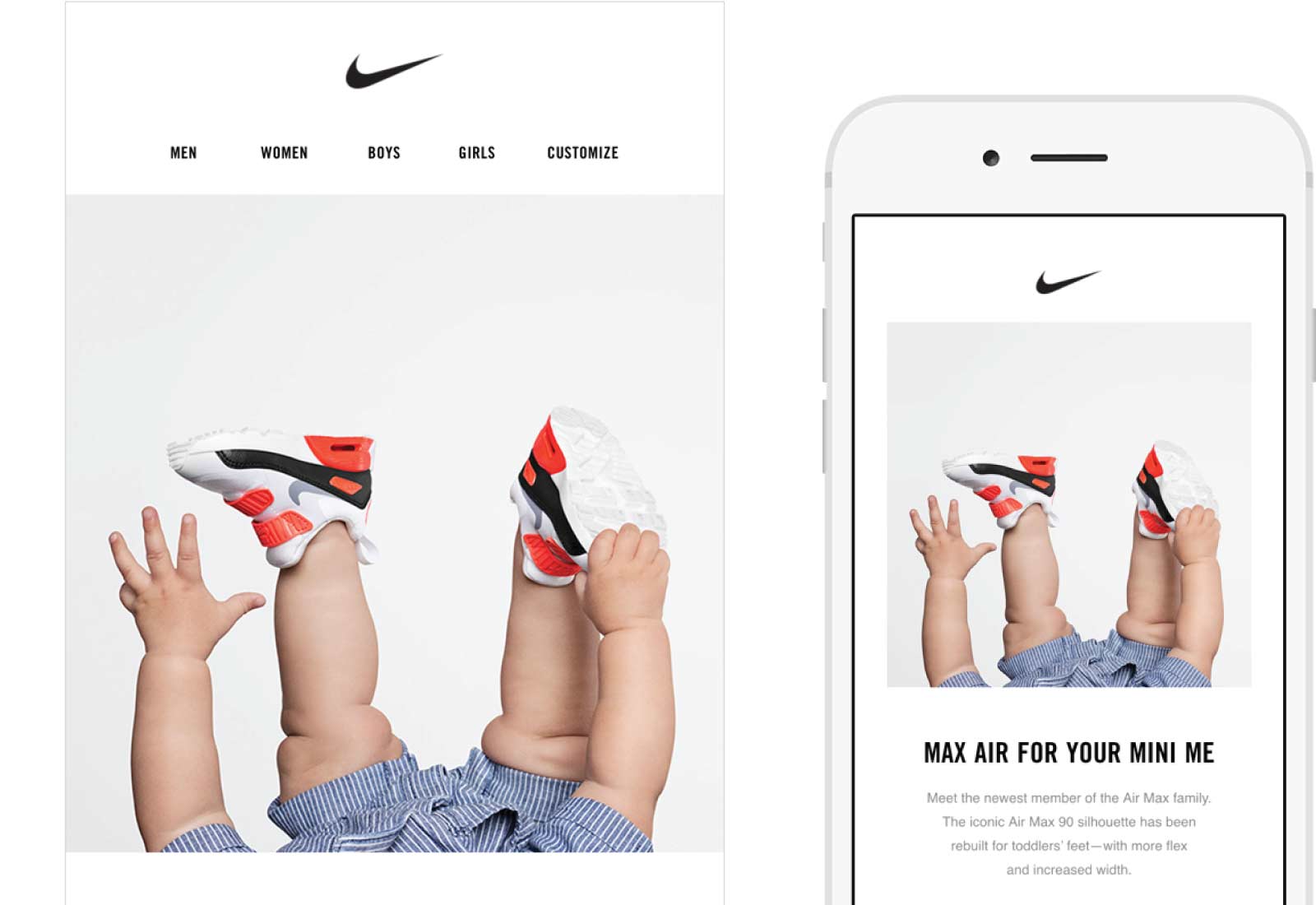
Nike
SUBJECT
Nike Air Max for the Littlest Feet
For some time Nike has used a single column mobile friendly approach to their emails and just recently I noticed they’ve made the switch from all images to using webfonts and real text instead. This is great example of how a company that is very protective of their branding can create emails that are in-line with their brand and easy to read for everyone.
I also love the image choice and main title…it actually ended with me purchasing a pair for my niece.

CHRISTINA’S PICK
American Girl
SUBJECT
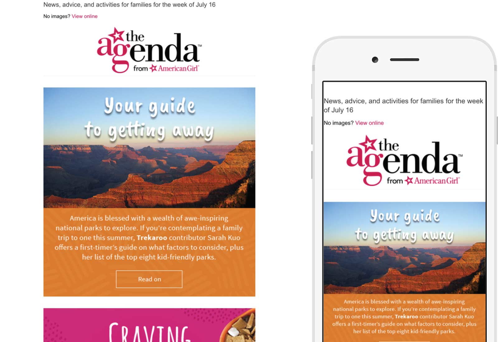
This week’s AGenda: National parks for newbies
Design wise, I really love all the bright colors and I liked how the CTA buttons are translucent as the background in the two top boxes. And, as a content writer, I like how “AGenda” is on brand with the AG overall theme. It’s a perfect name for this newsletter and lends to a nice hashtag should readers choose to share photos of their adventures on social (as prompted in the email).

LISA’S PICKS
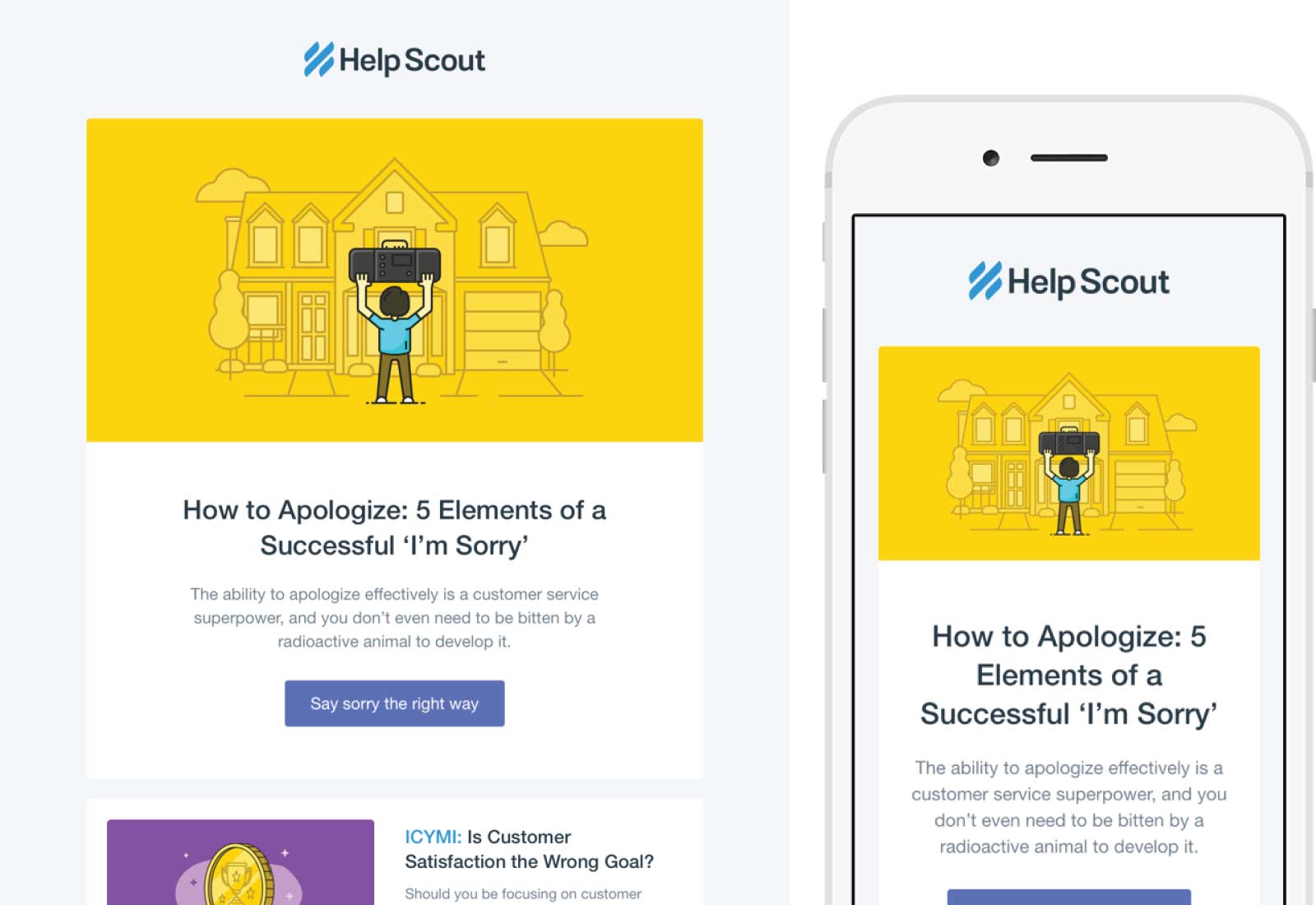
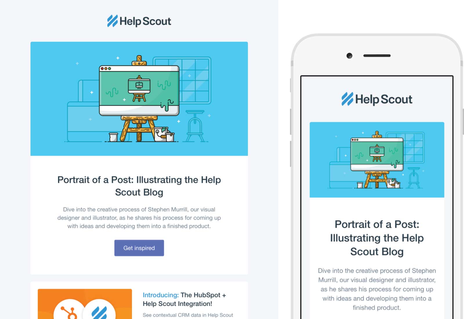
Help Scout
Twice a week I receive a beautifully illustrated email from Help Scout. They are colorful, vibrant and unique. In fact, I recommend you read the post featured in the first email example I’ve included, titled Portrait of a Post: Illustrating the Help Scout Blog.
A couple of years ago I subscribed to Help Scout because of a referral that came out of a MarketingProfs course I took on content. Help Scout is a superb example of what a blog should be and how to promote it through email. The blog is written to help the reader think. They offer insight through stories, real life examples, experiences and tips. What I love most about these posts is that they don’t sell. It’s just really good content that drives me to click through on other pages of their website to learn more.
I’ve included two examples here to show the consistency of their emails. The friendly from name is always the author of the post and the subject is the title. For example, Sunett at Help Scout, with the return email address [email protected]. The informative lead-in paragraph is typically three lines or less with a bold title. This is the only company I’ve seen use this style, but I may test it out myself in our next few emails. Help Scout always includes a clever, friction-free CTA button that intrigues me to convert. For example: “Say Sorry The Right Way” or “Get Inspired.”
SUBJECT
Portrait of a Post: Illustrating the Help Scout Blog
SUBJECT
How to Apologize: 5 Elements of a Successful ‘I’m Sorry’