With all the emails that end up in your inbox, there are always a few that stand out. Here at RootedELM, we’re email geeks — we admit it. Whether it’s outstanding content, design or development, when we see it, we want to share it. Watch for our insight here, direct from our own inboxes, and use it to inspire your next campaign.

CHRISTINA’S PICKS
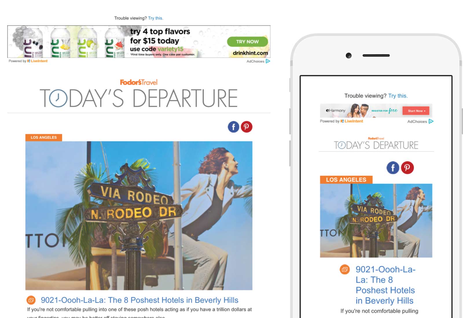
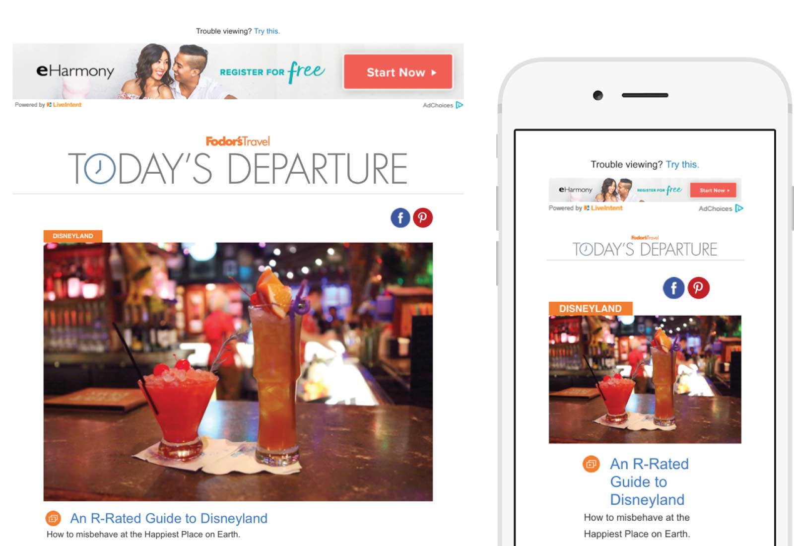
Fodor’s Travel
Fodor’s does an excellent job of drawing me in with their catchy subject lines—I honestly laughed at the “R-rated Guide to Disneyland”—and coordinating preview text. For example, the Disneyland email opens with, “How to misbehave in the happiest place on earth.” I like that each email is designed the same, with an article of interest for me to read, and then several other relevant links to travel information below. One thing I don’t like about these emails is the banner ad included across the top of each email. Not only is it distracting, but it’s clearly not based on my personal profile, as I am not in the market for a dating website.
SUBJECT 9021-Oooh-La-La: The 8 Poshest Hotels in Beverly Hills
SUBJECT An R-Rated Guide to Disneyland

LISA’S PICKS
Boxed
Boxed is an online company I tried in preparation for my daughters’ graduation party. So far, I’m impressed with the company and the content for their onboarding email series and transactional emails. I’ve received four campaigns in seven days — two transaction type and two welcome type. Each email has a friendly, personable tone and reassures the value of using Boxed.
WELCOME EMAIL SERIES:
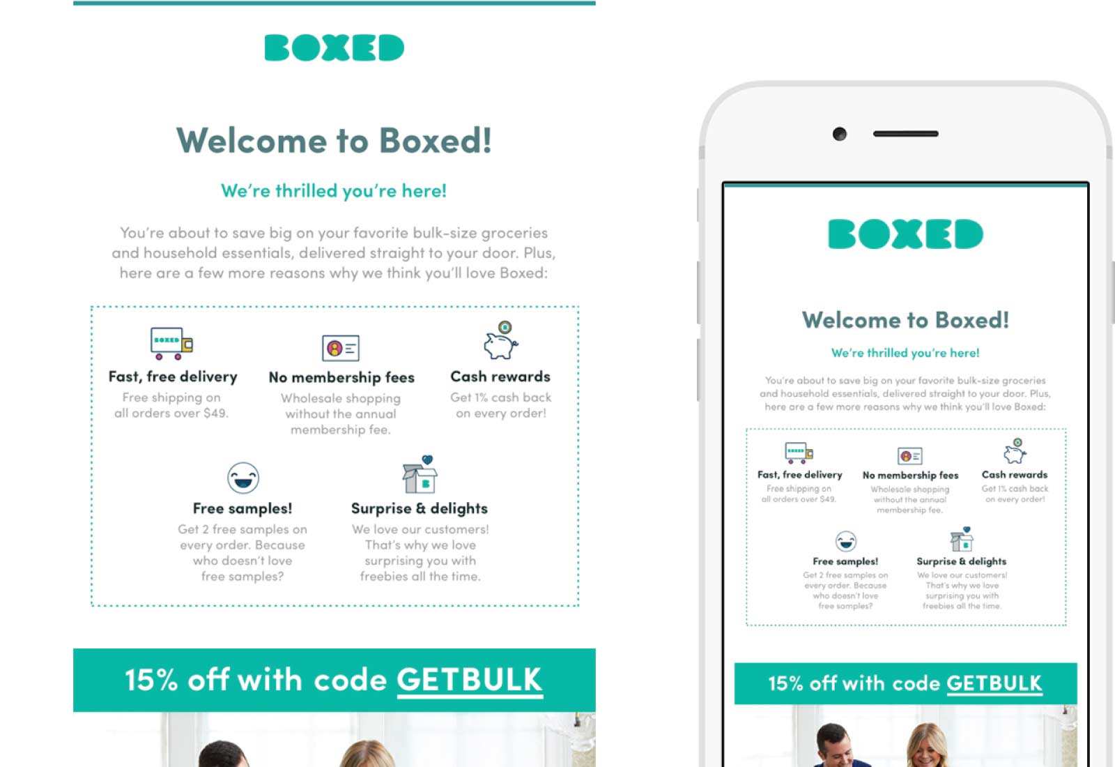
Email 1 does a nice job of setting expectations leading with You’re about to save BIG on your favorite bulk-size groceries and household products, delivered straight to your door. I was surprised with the 15% off incentive on my order, however I had ordered before I checked my inbox to find this email 😀. Kudos to Boxed for using an original image of a couple showing excitement to open their big box instead of stock art. Finally, the CTA is friction free and direct — Let’s Go Shopping (I did again!)
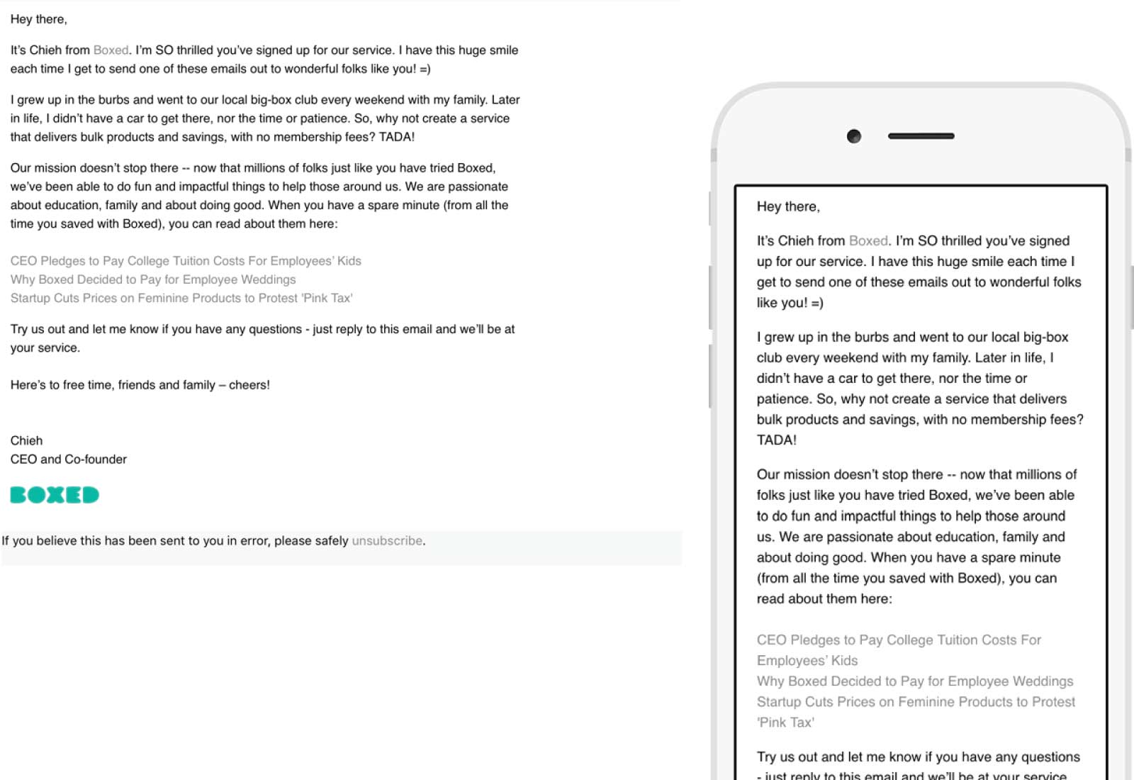
Email 2 of the welcome series used the friendly ‘from name’ Chieh Huang and at first, I didn’t know who it was from until I read the subject line: A warm welcome from Boxed! Even though the sender email address is [email protected], a suggestion would be to change the friendly from name to “Chieh Huang with Boxed.” Upon opening, I read the entire email and learned quite a bit about the company and their mission in just a few moments.
TRANSACTIONAL EMAIL CAMPAIGNS:
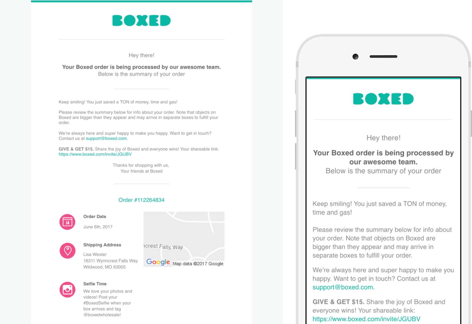
Email 1 reiterates their value with Keep smiling! You just saved a TON of money, time and gas! The incentive to share my new found excitement on another channel with a personal link — Give & Get $15 was nice.
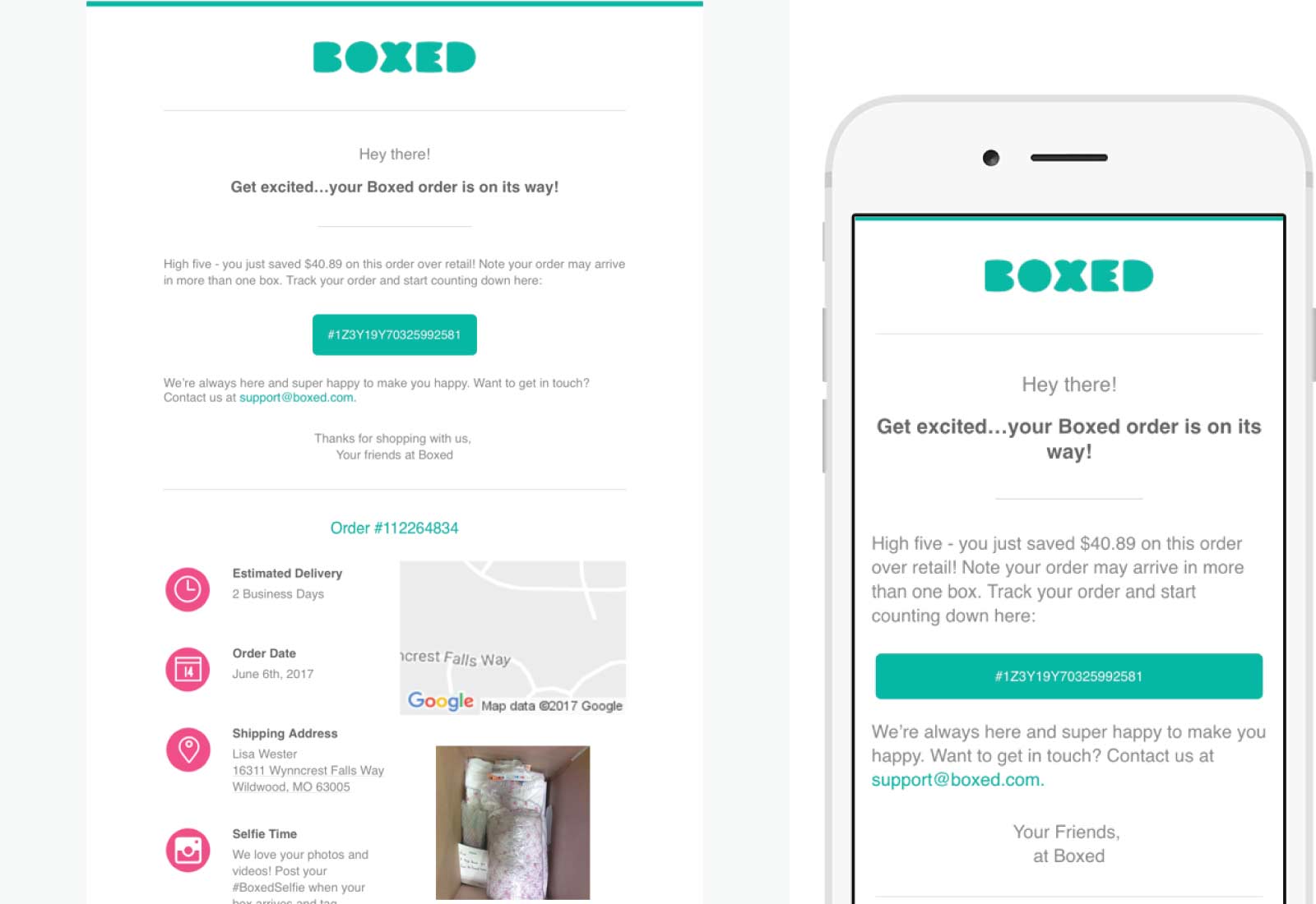
Email 2 again reiterated their value by personalizing how much money I saved with my order. Using my tracking order as the CTA was a huge bonus to check the status of my order. My wow factor, however, was the image they included of the interior of my order packed and ready to be shipped.
The email scopes below are listed in the order received.
SUBJECT Welcome to Boxed, we’re so glad you’re here!
SUBJECT Woo hoo! Your Boxed order is being processed!
SUBJECT Your Boxed order is on its way!
SUBJECT A warm welcome from Boxed!

JASON’S PICKS
Motorola
SUBJECT Moto Z is $200 off for a very limited time.
This campaign from Motorola stood out in my inbox mainly because I don’t remember receiving any emails from them since their purchase by Lenovo was finalized. The design is clean and mobile friendly with the single column design. I also love that other than the branded name of the phone everything else is actual text which they achieved by using a simple background and some transparent PNG’s. What stood out the most though was what was at the top of the email—a reminder of why I was getting this email. I’m not sure if this is the very first Motorola email I’ve received since their move to Lenovo but I think this is a great way to handle list migrations. Whether it’s because of a merger/acquisition or just a moving stale subscribers to a new ESP this is a great way to help keep your list clean — putting the unsubscribe at the top of the email — and not get marked as spam.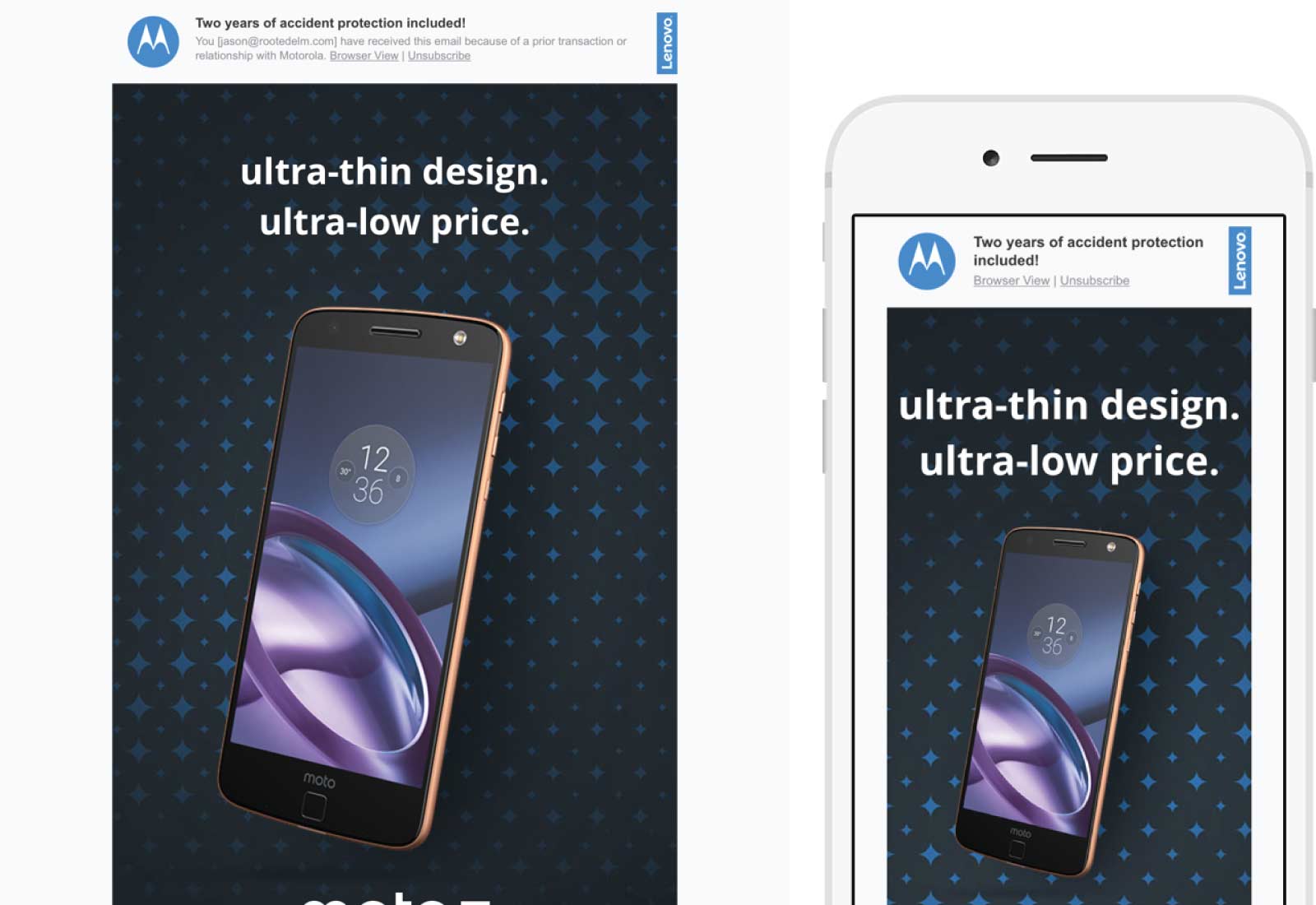
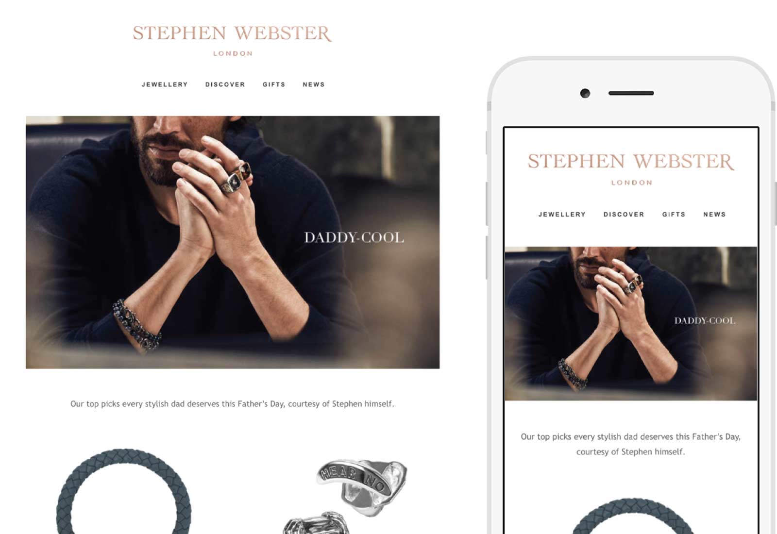
Stephen Webster
SUBJECT Help him look Daddy Cool this Father’s Day
I think this campaign could use a bit of design love (they could have easily changed up the font choices a bit to better match the brand and made them a bit larger) but really loved that they’ve moved from all images to a mix of images and actual text. Far too many fashion brands and designers send out campaigns where if you’re on a slow connection or have images off you see absolutely nothing all so their copy can be in skinny serifs. I applaud Stephen Webster’s step into modern email design and understanding that, while important, having two different typefaces in your print and online campaigns isn’t a bad thing. Bonus points for a responsive design and even using video in the campaign as well.