
With all the emails that end up in your inbox, there are always a few that stand out. Here at RootedELM, we are email geeks — we admit it. Whether it’s outstanding content, design or development, when we see it, we want to share it. Watch for our insight here, direct from our own inboxes, and use it to inspire your next campaign.

LISA’S PICKS
Sherwin-Williams
SUBJECT
RE: Donate your digital color to communities in need
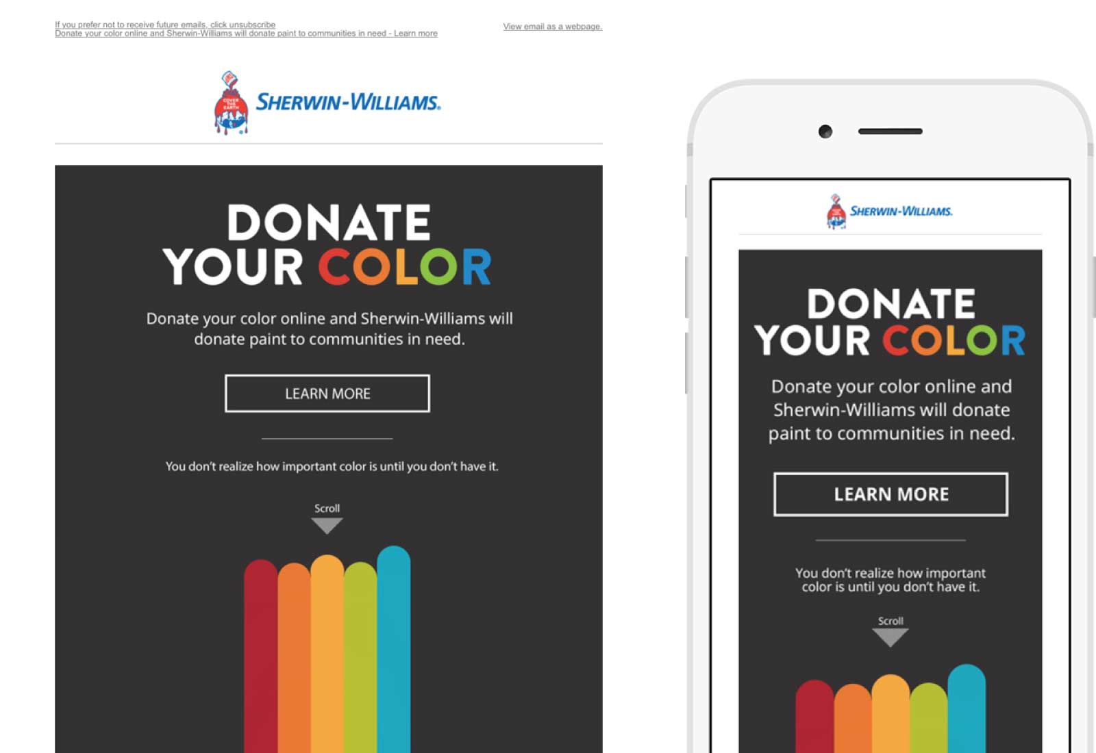
Sherwin Williams has a clever “color-full” or should I say “color-less” philanthropy campaign called Donate Your Color going on right now. The engaging email campaign promoting the humanitarian effort is original, fun and creative. With minimal lines of copy, this campaign had me doing just what they asked — to scroll, then click to learn more. I landed on a beautifully branded website supporting the email and even donated my digital color. In my opinion, this campaign met its goal.
The campaign renders beautifully on desktop as well as mobile however, because it is 100% image based, Sherwin Williams could have used actual text instead of text within an image for the content and call to action buttons to reduce load time.
fitbit
SUBJECT
Your May Newsletter
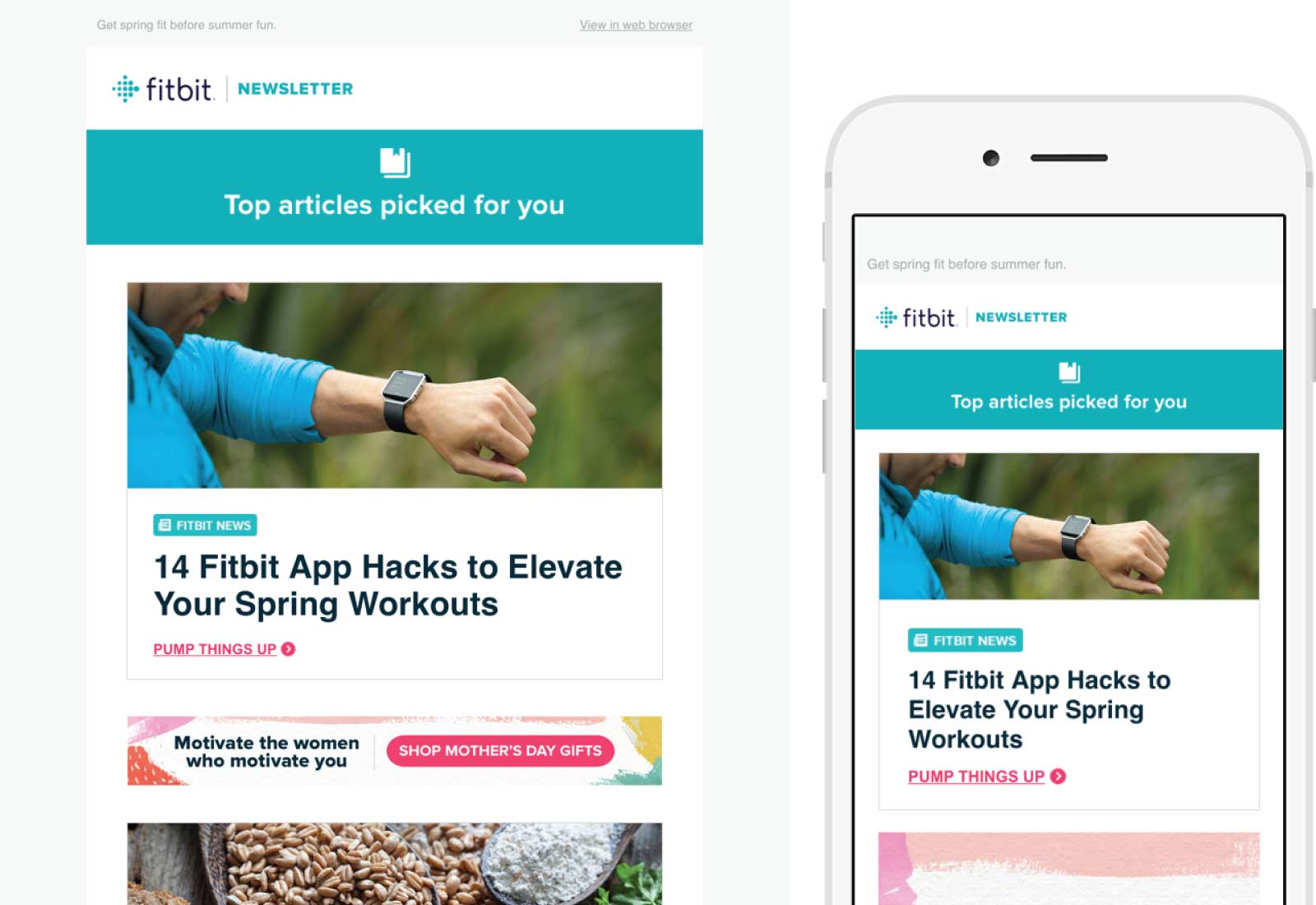
I remember being at the ExactTarget Connections conference a few years ago and hearing Scott Dorsey, CEO at the time, talk about how Fitbit, a wearable device, will track your daily fitness activity and send personalized emails using that data to educate and inspire your workouts. This email newsletter does just that.
Fitbit uses text as friction-free and formative call to action buttons that inspire me to take action. The email layout is clean, using two lines of header text for content and small image for a section header. Each section is supported by images of people wearing the device (instead of stock art) building confidence in the product and interest in the linked content.

JASON’S PICKS
Veerle Pieters
SUBJECT
Veerle’s weekly EDITION #00022
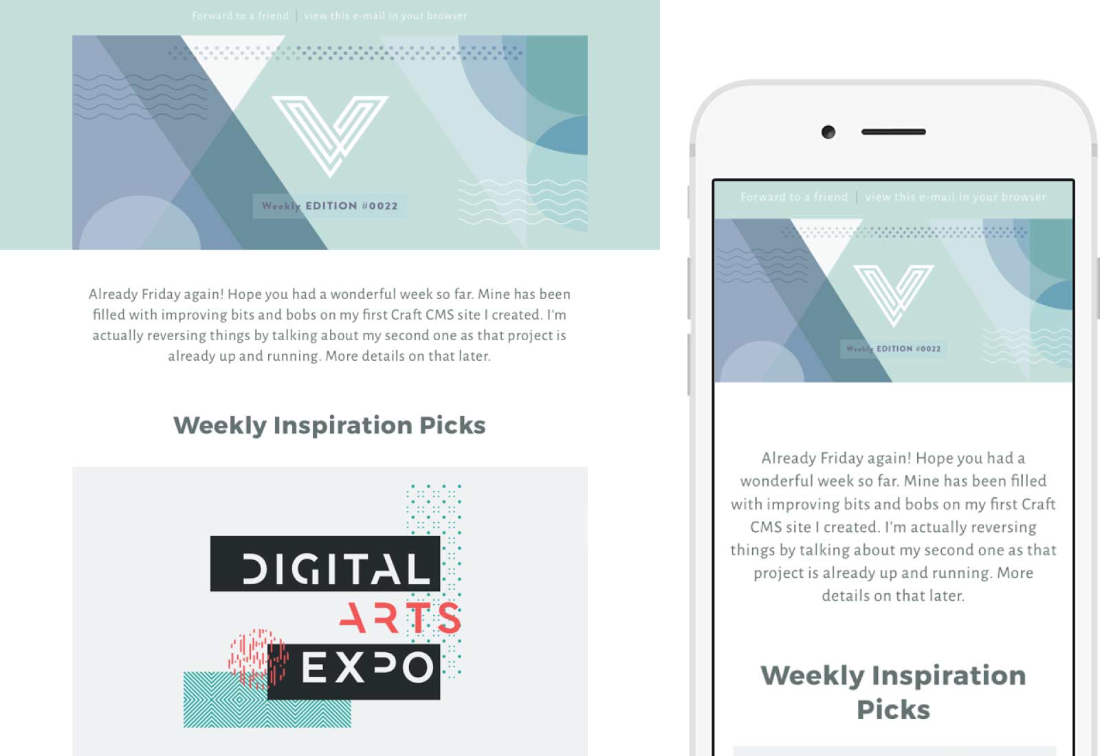
Far too many “newsletters” have devolved into digests of links driving you to the senders website. While digest type emails are fine — and sometimes extremely useful — the heady days of emails full of content is a dying art form. Veerle’s weekly newsletter is what a newsletter should be…a blog disguised as an email. She’s even monetized it by including content about a design bundle with a referral link.
YOOX News
SUBJECT
Men’s Style: 6 brands chosen for you
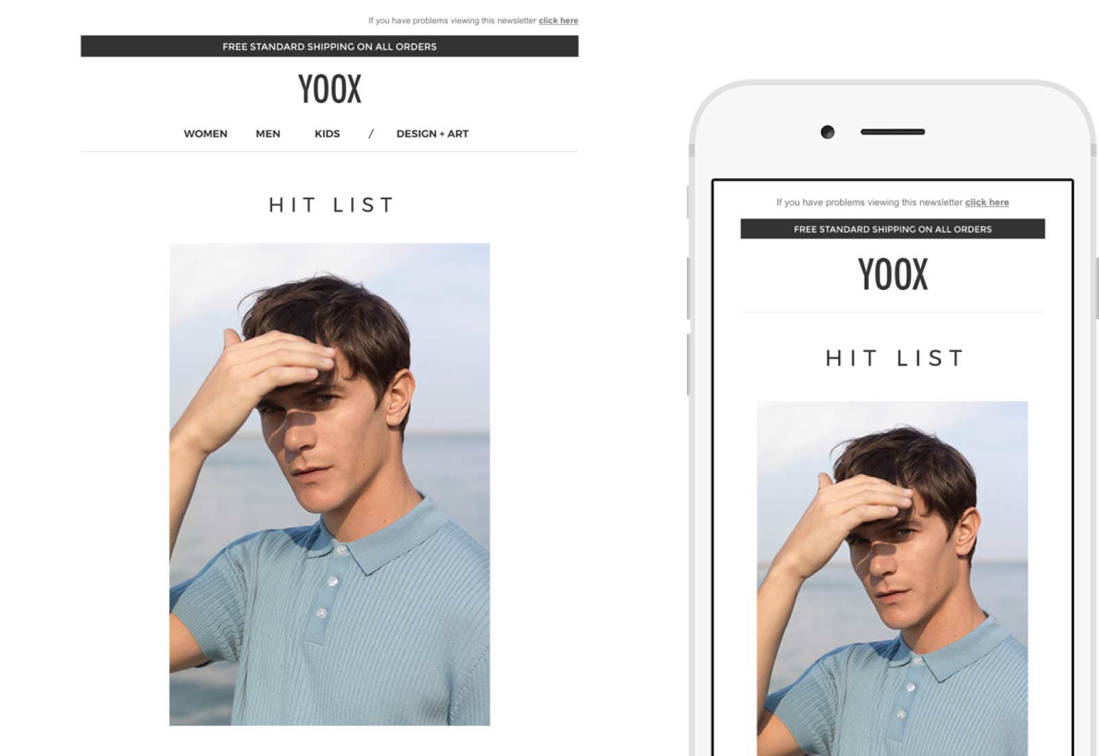
As far as lifestyle and fashion brands go YOOX typically sends some great emails. This one is no different, not only is it personalized to me — If you know I’m a man why would I be interested in dresses *caugh* Macy’s *caugh* — but it looks great regardless of your device. My personal favorite is how they collapse their content on mobile.
Their template is a hero image with three items beneath. Most fashion retailers would shrink the three items to the point of being unreadable. Those that care about their mobile audience might make them into a single column of items or float them so you have two items with the third on the bottom. YOOX takes a different approach though, they simply hide the third item.
I always stress that each client/device is different and an email doesn’t have to look identical on each. YOOX takes it to the next level showing that not even all content necessarily needs to be seen on every client.

CHRISTINA’S PICK’S
Kenneth Cole
SUBJECT
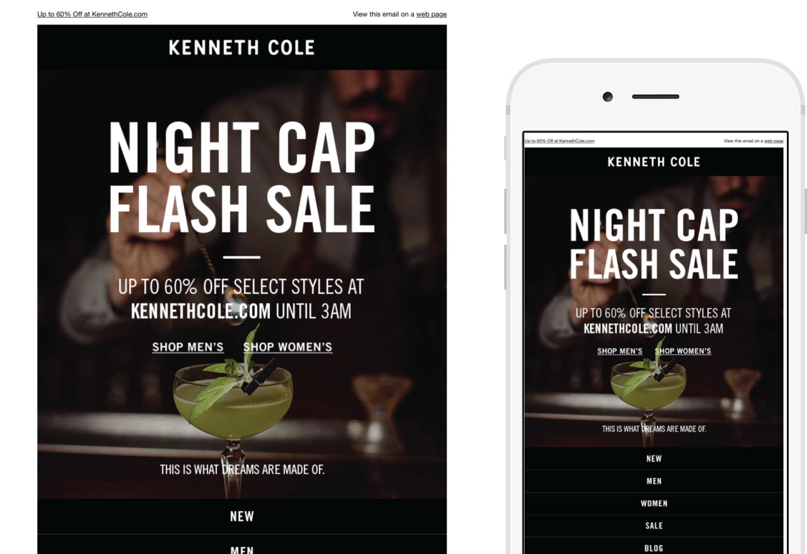
Treat yourself! Night Cap flash sale starts NOW
Arriving in my inbox just after dinner, this email included clever copy and a sense of urgency to shop, but with a twist. The sale ends at 3 am, in keeping with the night cap theme. The image of the fancy cocktail and the words, “This is what dreams are made of,” topped off the fun. Again, easy to navigate and simple. A sense of urgency that does not cause friction.
Lucky Brand
SUBJECT
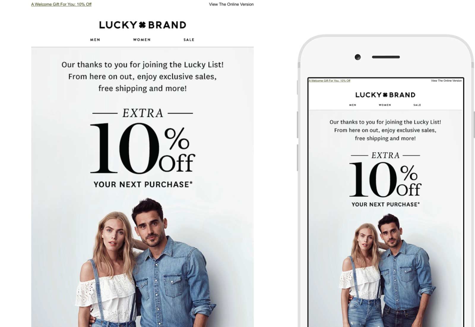
It’s Official. You’re On The List!
This Welcome email from Lucky Brand is clean, simple and includes a 10% off offer to redeem now that I joined. I like the copy which is both inclusive and friendly. I also like the clean design, and that I can click on text to shop, find a store, etc. Easy to navigate. No distractions.
Here you can create the content that will be used within the module.