With all the emails that end up in your inbox, there are always a few that stand out. Here at RootedELM, we are email geeks–we admit it. Whether it’s outstanding content, design or development, when we see it, we want to share it. Watch for our insight here, direct from our own inboxes, and use it to inspire your next campaign.

JASON’S PICKS
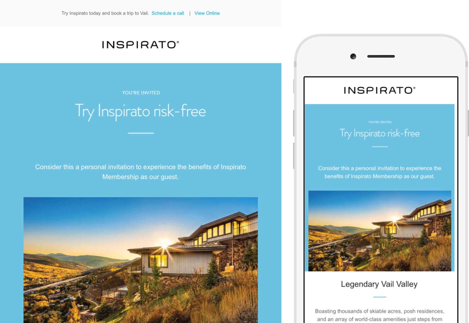
Inspirato
SUBJECT
Legendary Vail Valley
The high end luxury market – whether it’s jewelry, cars, or real estate – are targeting the wealthiest among us but all too often their emails tend to fall flat. Half the time it looks like they’re trying to shoe-horn a magazine ad into your inbox and of course, it’s typically one or two giant images. Inspirato, a luxury vacation club, cuts through the norm and is a prime example of what others in the luxury world should strive for when crafting their email campaigns.
Inspirato knows their market well and has capitalized on that by sending on-brand messages that work extremely well on the devices people are using. From the images of their vacation properties to the layout that looks great regardless of your screen size, their emails always exude luxury. I think you’d be hard pressed to find someone that had no desire to join Inspirato – whether they could afford it or not – after getting several of these emails.
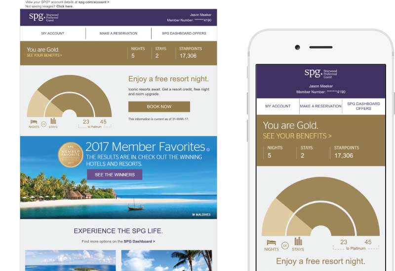
Starwood Preferred Guest
SUBJECT
Your April eStatement
Starwood Hotels and Resorts have an extremely loyal base of customers. In fact, those customers and Starwood’s loyalty program, Starwood Preferred Guests or SPG, was one of the main reasons that Marriott gave for their recent purchase of the company. Luckily for those of us that are members of the SPG program, most everything has stayed the same, including their great monthly statements.
Automated emails tend to have the highest level of engagement for sends. However, when those automated sends include various amounts of data to be displayed, most designers typically go the bland spreadsheet approach. While sometimes a regurgitating of numbers on an automated statement is all that is needed, the majority of the time a graphical display of that data is going to be more meaningful to the recipient. SPG takes that cue and makes their monthly rewards statement easy to read and understand at a glance while continuing to incorporate marketing messages. It’s another reason why it pays to be an SPG member.
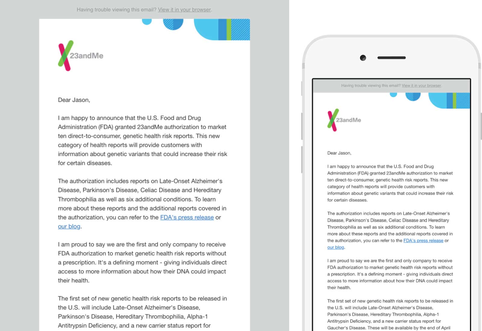
23andMe
SUBJECT
Good News About Health Reports
Sometimes content for an email needs to incorporate nothing more than good ole fashioned text. No big call to action button, no flashy image — just a short message from you to your subscribers or members. 23andMe had such an email recently and didn’t try to pretend that their CEO was sending you a message from Outlook. It looked great and showed how a textual email can be branded, simple and impactful.

CHRISTINA’S PICK’S
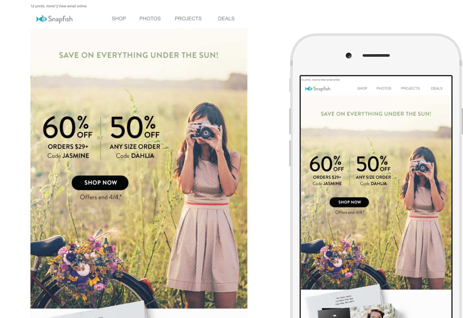
Snapfish
SUBJECT
🌈 60% off sitewide shines on through tomorrow!
Let’s face it, an offer of 60% off right in the subject line always catches my attention, but it was really the rainbow emoji that caught my eye first. Using a rainbow elicits happy and positive feelings, preparing me to be open to the rest of the email’s message. I clicked through and found sales on items I can use right now for the busy Spring season. Overall I wasn’t moved to make a purchase, but the emoji did its job of getting me to open the email.
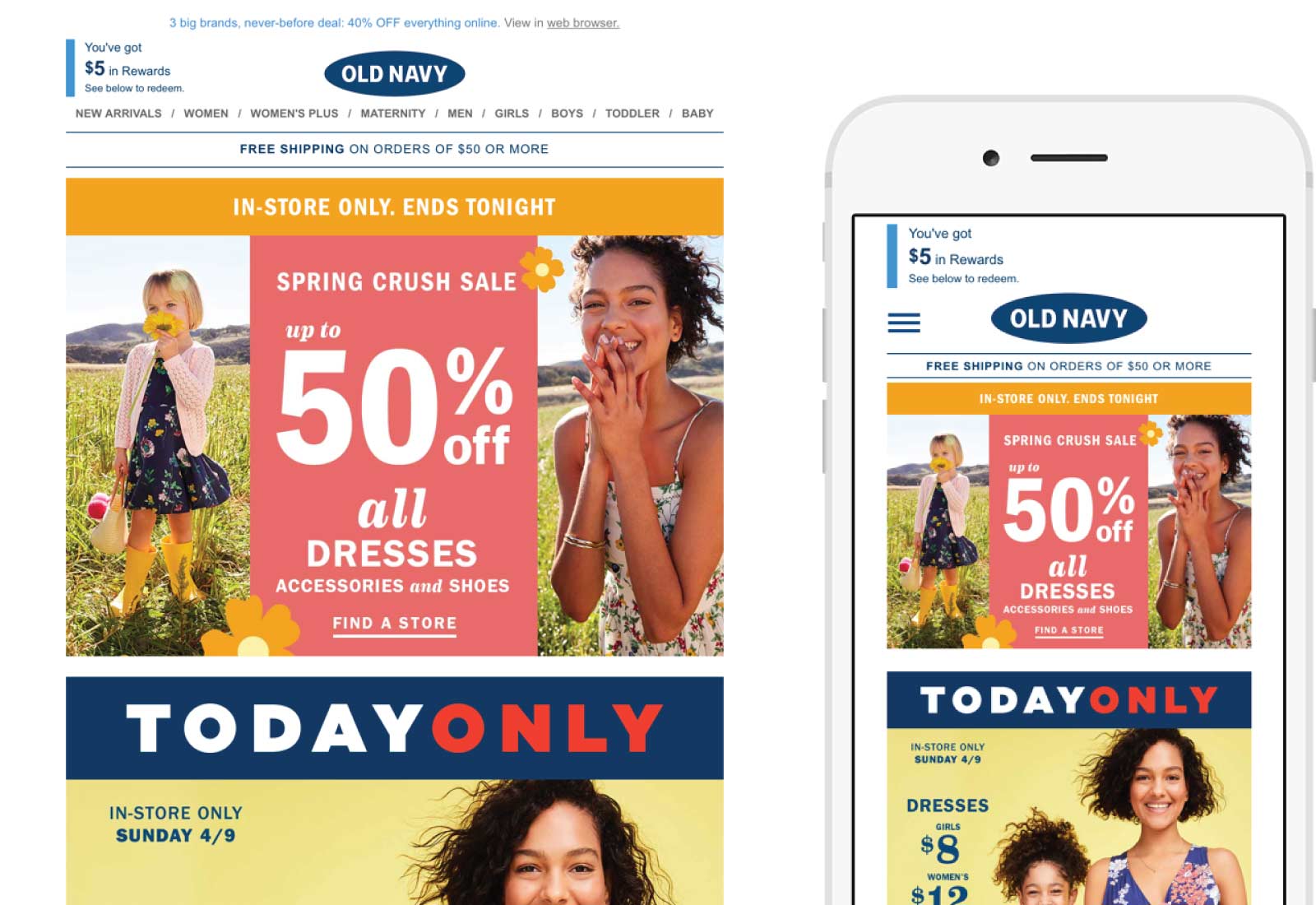
Old Navy
SUBJECT
💃 Your name is on the list for $12 dresses & $10 ballet flats
Although I’m not typically an Old Navy shopper, and couldn’t remember signing up for their emails, I smiled when I saw this one pop up with dancing fiesta lady. There’s just something about a woman dancing in a red dress that makes me feel festive! As a content writer, I also especially liked how the subject line addressed me directly. Who doesn’t want their name on a list of dresses and ballet flats this time of year? I opened out of curiosity and although I found the email to be too busy and overwhelming, I still appreciated the catchy emoji and subject line that attracted me to open in the first place.
LISA’S PICKS
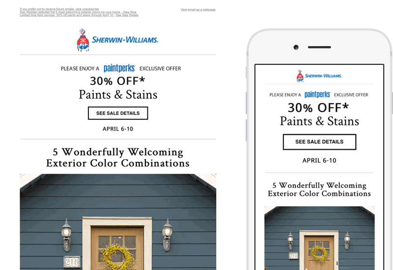
Sherwin Williams
SUBJECT
5 welcoming exterior color combinations | Your exclusive 30% off sale ends Monday.
How did Sherwin Williams know I needed to paint my front door? This very helpful campaign, animated with five colorful visuals, caught my attention immediately. The mention of the sale completely slipped by me as my focus was on the animation and which color combination would be perfect for my entrance.
This email is full of best practices, leading with a solid subject line and a pre-header, shown only in my inbox preview, that re-iterated the second half of the subject line (below).
Sherwin Williams is using real text instead of images as text, allowing the content to be readable on all devices. Something that you don’t see often is the placement of the unsubscribe link at the top as well as the bottom of the email. I like this as it’s the first thing you see, telling the subscriber they care about your preferences and only want you to be there if you want. They have three pre-headers stacked closely together on desktop which would be an issue on a mobile device but they disappear on mobile.
The content has been well thought out. It’s short and to the point, they use several friction-free calls to action buttons each leading to a branded landing page. They even give kudos to the employee who selected the perfect color palate.
This email is full of inspiration and information on how to achieve painting my entrance, but it’s also the perfect example of an email campaign done right.
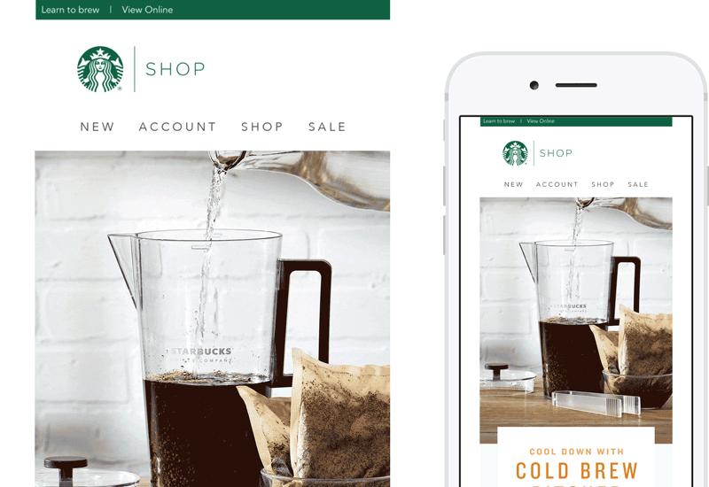
Starbucks
SUBJECT
Easy-to-make Cold Brew Pitcher Packs are back
The informative, “how-to” element of this subject line intrigued me to open. Much like the Sherwin Williams campaign, the animation drew me in, followed by the video with steps on how to make the perfect pitcher of cold brew coffee.
The downside to this campaign is that Starbucks uses images for every piece of this email, including the menu. The only exception is the footer area.
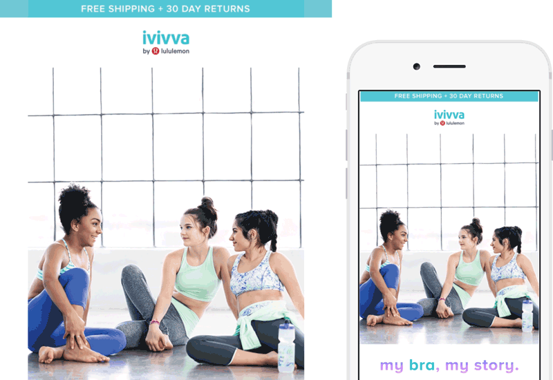
Ivivva
SUBJECT
my bra. my story.
Obviously my theme this week is animation. I like what Ivivva has done here with the play on words with the product theme of the campaign. Ivivva supports the content with a video testimony taking you behind the scenes. The testimonies bring the product to life.