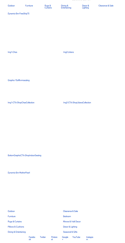
Have you ever received an email, say from your favorite retailer, that included a coupon code you couldn’t wait to use? Most of us don’t write down the code; we simply click to the website to make our purchase. When it’s time to purchase, ideally we can use our mouse to copy and paste the code from the email into space allocated on the checkout page. But if that code is embedded within an image, as shown in the example below, on the original email, we’re out of luck.
The solution to this problem is in the original email design code. Many emails, including those from large, national companies, embed text as images within the email. How can you tell? Pull up the next marketing email that lands in your inbox; hover your mouse over a group of text. If you can copy and paste that text, it is real text; if the text moves together as an image would when you grab it, then it’s an image.
Why is real text better for email design?
It can be seen in the email even when the images are not loading or are turned off, allowing your audience to see your message regardless.
Your emails will upload faster, and they will upload every time on every device, which leads to a higher response rate.
Your customers are less likely to become frustrated because coupon codes or other vital text can be copied and pasted when needed.
At RootedELM, we want to provide the highest quality email design for our customers. We code emails with text and we use Litmus, an email preview, analytics and spam filtering tool, to test how the email will render on different email providers (for example Gmail, Outlook, iPhone, etc). We provide fallback fonts in the font stack in the code, so if a certain platform can’t find the correct font, it will still render in a similar and attractive way.
Check out the examples below to see how real text makes a huge difference in email design:
In this example, designed by RootedELM, special fonts are shown as actual text which will show up even when the images do not load. The ability to read the text means customer still receives the message even when images do not load. In addition, adding background color blocks to the code where images should load makes the viewer more likely to reload or turn on images.
In this final example from a national retailer, text was designed as images and is not seen when images do not load. We are left viewing a bunch of white space and having no idea what this email is about. There is no incentive to try to load the images and the email will likely be deleted because it frustrates the receiver.
The bottom line is: the best email design includes actual text on key messages so you never miss the opportunity to engage with your subscriber — even with images off.
———-
We are always looking for ways to provide the highest level of email design to our customers. At the end of August, our own Jason Meeker attended #TEDC15 The Litmus Email Design Conference in Boston to gain even more insight. He just couldn’t get enough, so this weekend, he travels to London to take part in The Litmus Email Design Conference there, too! Follow along this Monday on Twitter as Jason tweets away more terrific tips and information straight from the conference. We’ll be re-tweeting his most important musings @RootedELM.


